How to Reduce Churn for Mobile Apps
Discover how to reduce churn with proven strategies for mobile apps. Learn to master onboarding, engagement, and user feedback to boost retention.
To stop users from leaving your app, you have to figure out why they're leaving in the first place. This isn't a guessing game. It means digging into your data and analyzing things like cohort behavior, Customer Lifetime Value (CLV), and specific drop-off points. Skipping this step is like trying to fix a leaky pipe blindfolded—you'll waste a ton of effort and probably make a bigger mess.
Diagnosing Why Users Leave Your App
Knowing your overall churn rate is a start, but it's not enough. It’s like a doctor knowing a patient has a fever without understanding the cause. Is it a common cold or something more serious? To truly reduce churn, you have to play detective and investigate the underlying reasons.
This diagnostic phase is the most important part of building a retention strategy that actually works. It's where you stop making assumptions and start asking sharp questions based on what your users are actually doing inside your app.
To do this right, you need to look at a few key areas:
- Cohort Analysis: Group users by the week or month they signed up. This lets you see if changes you made to the app in February, for instance, led to better retention than for the users who joined in January. It's a fantastic way to measure the real-world impact of your updates.
- Segmentation: Go deeper than just sign-up dates. Analyze behavior based on where users came from (an Instagram ad vs. organic search), what device they're on, or what features they use. You might discover that users acquired from a specific ad campaign churn twice as fast, pointing to a mismatch in expectations.
- Drop-off Points: Pinpoint exactly where users are bailing. Is it during the first 60 seconds of onboarding? Or right after their free trial ends? High churn in the first 24 hours almost always signals an onboarding problem, while a mass exodus after a trial suggests your paid features aren't compelling enough.
Moving From Raw Data to Actionable Insights
Gathering data is easy. Turning it into a plan is the hard part. Two of the most powerful metrics to focus on are your churn rate and Customer Lifetime Value (CLV). Churn tells you how many people you're losing, while CLV tells you how much the ones who stay are worth. Looked at together, they give you a brutally honest assessment of your app's health.
This chart shows just how tightly these two numbers are linked.
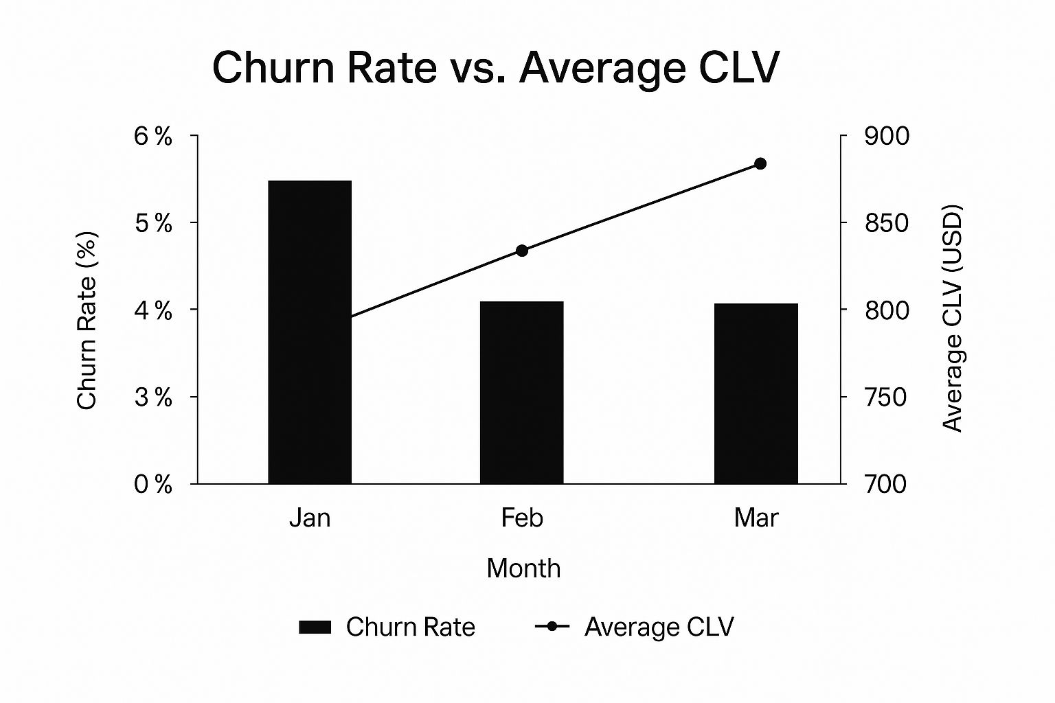
You can see that as the churn rate dropped over three months, the average CLV climbed. It’s a perfect illustration of how even small wins in retention can have a huge impact on your bottom line.
To get a clearer picture of what you should be tracking, here are some of the essential metrics for diagnosing churn.
Essential Churn Metrics for Mobile Apps
This table breaks down the core metrics that will help you understand not just if users are leaving, but why and when.
| Metric | Calculation | What It Tells You |
|---|---|---|
| User Churn Rate | (Users at Start - Users at End) / Users at Start | The percentage of users who stop using your app in a given period. Your top-line retention health indicator. |
| Session Length | Total Time Spent in App / Number of Sessions | How long users actively engage during a typical visit. Short sessions can signal a lack of "stickiness." |
| Daily Active Users (DAU) / Monthly Active Users (MAU) | Number of unique users per day / per month | Measures overall user base engagement. A declining DAU/MAU ratio is an early warning sign of churn. |
| Activation Rate | (# of Users Completing a Key Action) / (# of New Users) | The percentage of new users who experience your app's core value. Low rates point to onboarding friction. |
| Customer Lifetime Value (CLV) | (Average Revenue Per User) x (1 / Churn Rate) | Predicts the total revenue you can expect from a single user. Highlights the financial impact of retention. |
| Time to Churn | Average # of days from install to last session | How quickly you lose a typical user. A short "Time to Churn" often means a poor first-time user experience. |
Tracking these numbers consistently will give you the "vital signs" for your app's health, allowing you to spot problems before they become critical.
Setting Up Your Diagnostic Toolkit
You can't track what you don't measure. To get these insights, you need an analytics platform like Mixpanel, Amplitude, or Google Firebase configured to track the right user actions. This means going beyond simple screen views and logging the key events that show a user is engaged—or about to churn. If you're just getting started, you can find helpful guides on defining the right segments and events for your app.
The goal is to build a dashboard that acts as an early warning system. It should immediately tell you when a specific cohort is churning faster than usual or when fewer users are completing a critical onboarding step.
Think of it like this: your analytics dashboard is your patient's chart. A single bad number is a symptom. But when you look at all the vital signs together, you can make a proper diagnosis. Putting in this foundational work is the only way to ensure your retention strategies are targeted, effective, and built to last.
Nailing the First Week Experience
The first week a user spends with your app isn't just a trial period; it's the main event. This is where most people decide whether your app gets a permanent spot on their home screen or joins the digital graveyard of deleted apps. If they don't get it—and get it fast—they're gone.
Successfully navigating this initial phase is the bedrock of reducing churn. It's all about making a powerful first impression that proves your app solves a real problem for them, making the thought of leaving a non-starter.
The Make-or-Break First Session
You really only get one shot at a great first impression. The entire goal of that very first session is to rocket the user to their "Aha!" moment—that instant where they truly understand how your app makes their life better. This isn't the time to show off every single feature you've spent months building.
Instead, zero in on the one key action that delivers immediate value. For a photo editing app, it’s applying that first killer filter. For a task manager, it's the simple satisfaction of adding and checking off a single to-do item.
A clunky first session is more damaging than you might think. We've seen data consistently show that a bad onboarding process alone is responsible for 23% of customer churn. When you layer on weak relationship-building and poor customer service, the numbers get even scarier. It just hammers home how critical it is to get that initial welcome right. You can read more about the impact of early user experiences on retention to see the hard numbers.
Designing an Onboarding Flow That Guides, Not Annoys
Let's be honest: the classic, multi-screen static tutorial is dead. Users don't read manuals; they want to do things. A modern onboarding flow should feel less like a lecture and more like a helpful friend pointing the way.
The best way to do this? An interactive walkthrough. This means prompting users to take small, meaningful actions right inside the app's actual interface.
Here are a few approaches that work well:
- Contextual Tooltips: Ditch the full-screen overlays. Use small pop-ups that point to specific buttons or features exactly when the user needs them.
- Empty State Guidance: When a user opens a feature for the first time, that "empty state" (like an empty project list) is prime real estate. Use that space to prompt their first action, like "Tap '+' to create your first project!"
- Gamified Checklists: Nothing beats the feeling of progress. Create a simple onboarding checklist (e.g., "Create a profile," "Add a task," "Invite a team member") to give users a sense of accomplishment as they complete key steps.
The goal is to build momentum. Every small, successful action a user takes reinforces their decision to download your app and gets them more invested in seeing what else it can do.
Personalization from the Very Beginning
One size just doesn't fit all. A generic onboarding experience feels cold and often misses the mark on a user's specific goals. You can radically improve that first-week experience just by asking a simple question upfront: "What do you want to achieve with our app?"
Based on their answer, you can then tailor the entire onboarding journey.
Example Scenario: A Fitness App
Let's say a user downloads your fitness app. On the first launch, you ask if their goal is to:
- Lose Weight
- Build Muscle
- Improve Endurance
If they tap "Build Muscle," the app can immediately personalize their entire experience:
- Prioritize Features: The onboarding flow now highlights the weightlifting tracker and protein intake log before anything else.
- Suggest Content: It starts recommending muscle-building workout plans and relevant articles right away.
- Set Realistic Goals: It can help them set an achievable goal for their first week, like completing three strength-training sessions.
This personalized path makes the user feel seen and instantly shows them that the app is built for them. This simple step can dramatically increase the odds of them sticking around past day seven.
Engineering the 'Aha!' Moment
The "Aha!" moment is the emotional payoff. It's the instant a user thinks, "Wow, this is exactly what I needed." Figuring out what this moment is for your app is crucial, because your entire onboarding should be engineered to get users there as fast as humanly possible.
- Music App: The moment a user creates their first custom playlist and hears a seamless transition between their favorite songs. That's the magic.
- Budgeting App: The moment they connect their bank account and see their spending categorized automatically, revealing insights they've never had before.
- Language Learning App: The moment they successfully complete their first spoken conversation with the AI tutor and realize they can actually do it.
By focusing relentlessly on a personalized, action-oriented, and value-driven first week, you move beyond just showing users how your app works. You show them why it matters. This creates a sticky experience that lays the foundation for long-term retention and helps you cut churn before it even has a chance to start.
Keeping Users Engaged for the Long Haul

A fantastic onboarding experience gets users in the door, but it’s no guarantee they’ll stick around. The real work begins after that initial "wow" moment. You have to move users from casual interest to ingrained habit, and that’s where most apps fall flat.
Lasting engagement isn't about spamming users with "We miss you!" notifications. It's about becoming a genuinely helpful, non-intrusive part of their lives. You want to create systems that pull people back because they want to return, not because you're shouting at them. It's all about delivering consistent value long after the novelty has faded.
Crafting Communication That Actually Connects
There’s no faster way to get your notifications muted than by blasting everyone with the same generic message. The one-size-fits-all approach is dead. The smart play is using behavioral segmentation—grouping users based on what they actually do (or don't do) inside your app.
This simple shift lets you send push notifications and in-app messages that feel less like ads and more like helpful tips from a friend.
- For your new power users: See someone who's used a premium feature three times this week? Don't just ignore them. Send a quick tip on an advanced shortcut for that exact feature. You'll make them feel like a pro.
- For your casual browsers: What about the user who logs in weekly to check a dashboard but never clicks anything else? Nudge them with a message highlighting a related tool they haven't tried.
- For those who are slipping away: A user was active daily, but now they've been gone for five days. This is a critical moment. Instead of a generic plea, get specific. "You're one workout away from hitting your monthly goal!" is way more powerful than "Come back!"
This kind of personalized communication changes the entire dynamic. You’re no longer a noisy app; you’re a helpful concierge.
Building Habit-Forming Loops
At its core, long-term retention is all about habit. You want your app to become a natural part of someone's routine, like brewing coffee in the morning. To get there, you need to build loops that encourage repeated, rewarding behavior.
Gamification gets a bad rap, but when done right, it's incredibly powerful for this. Forget about meaningless points and badges. Focus on tangible progress.
The secret to a solid habit loop is simple: Cue, Routine, Reward. A push notification is the cue, completing a task in the app is the routine, and seeing a progress bar fill up is the reward.
Take a language-learning app, for example. The daily "streak" is a classic for a reason. A reminder (cue) prompts the user to complete a lesson (routine), which keeps their streak alive and maybe unlocks a "gem" (reward). This little loop creates a huge psychological pull to come back every single day. The goal is to make using your app feel like an accomplishment.
Spotting and Winning Back At-Risk Users
Churn rarely happens overnight. Most users slowly drift away, and they leave a trail of breadcrumbs on their way out. The trick is learning to spot those signs before they’re gone for good.
Keep an eye out for dips in activity that break from their established patterns. A sudden drop in session frequency, ignoring a key feature they used to love—these are red flags. A user who logged in daily for a month and then vanishes for three days is a much higher risk than someone who has always been a weekly visitor.
Once you spot these signals, it’s time for a targeted re-engagement campaign. This is your shot to intervene.
A Simple Re-Engagement Workflow
Here’s a tiered approach I’ve seen work wonders for pulling users back from the brink:
- The Gentle Nudge (Day 3 of Inactivity): Start with a personalized push notification that references their last activity. For a project management app: "Ready to tackle your next task in the 'Q4 Launch' project?"
- The Value Reminder (Day 7 of Inactivity): If they don't bite, switch to email. Highlight a new feature they might find useful or share a quick success story from a user like them. You're reminding them of the value they're missing out on.
- The Special Offer (Day 14 of Inactivity): This is your final attempt. Reignite their interest with a real incentive—a temporary discount on the premium plan or a free trial of an exclusive feature.
By tailoring your outreach like this, you stand a much better chance of reminding users why they signed up in the first place. For a deeper dive, our guide on proven https://nuxie.io/blog/mobile-app-retention-strategies offers even more frameworks you can adapt. Building these proactive systems is how you turn potential churn into renewed engagement.
Optimizing Your Subscription Funnel

For most apps with a subscription model, the paywall isn't just a gate; it's a cliff where a ton of potential customers drop off. This is a massive churn point, but I see it as a massive opportunity. The trick is to shift your mindset. Stop thinking of the paywall as the final hurdle and start treating it as part of your value proposition.
When you do it right, the subscription process isn't just a transaction. It's the moment that solidifies a user's commitment, making them far less likely to have buyer's remorse and cancel a week later.
Framing Value Before the Ask
The single biggest mistake you can make is springing a paywall on someone out of nowhere. The conversation about what your app is worth has to begin long before you ask for their credit card details. By the time a user lands on your pricing screen, they should already be nodding along, completely sold on the idea that your premium features are a no-brainer.
How do you do that? You weave the value of a subscription into the entire app experience.
- Tease premium features. Use subtle "pro" or "premium" badges on locked features. When a user taps one, don't just hit them with a paywall. Instead, show a quick, compelling screen that explains what the feature does and, more importantly, how it will make their life better.
- Use contextual upgrade prompts. Let's say a user in your task manager app just tried to create their third project, but the free plan has a limit of two. That's the perfect moment to prompt them. Explain how the premium plan offers unlimited projects, solving a problem they just ran into. The value is crystal clear.
The goal is to make the decision to subscribe feel like the user's own idea. It should be the logical next step in their journey, not a jarring interruption.
Experimenting with Pricing and Tiers
There's no golden ticket for pricing. What works for a meditation app will fall flat for a photo editor. This is why you have to be constantly A/B testing your paywall. Don't just set your prices and forget them. You need to be experimenting relentlessly to find that sweet spot that maximizes both conversions and long-term retention.
Not sure where to start? Try testing these core elements:
- Trial Length: Is a 7-day trial better than a 3-day trial for your specific audience? A shorter trial can create a sense of urgency, but a longer one might give users more time to get hooked and form a habit. Test which one leads to a better trial-to-paid conversion rate.
- Pricing Tiers: Play around with different plan structures. A simple monthly vs. annual choice is a good start, but what about a "Pro" and "Pro Plus" tier? This can cater to different needs and budgets. Highlighting one option as the "Most Popular" is a classic social proof tactic that absolutely works.
- Price Points: Test different prices, even small jumps like going from $9.99 to $12.99 a month. You might find that a higher price point converts slightly fewer users but brings in more revenue and attracts customers who are less likely to churn.
For a much deeper dive into structuring these screens, our guide on designing effective paywalls is packed with detailed concepts and real-world examples.
Preventing Involuntary Churn
Here’s a hard truth: not all churn is intentional. A surprisingly large chunk is involuntary churn—when a customer's payment fails because of an expired card, insufficient funds, or a random bank decline. This is the silent revenue killer, but the good news is it's also the easiest type of churn to fix.
This is where a solid dunning management process comes into play. Dunning is simply the process of communicating with customers to sort out billing failures. A smart, automated dunning process can recover a huge portion of those failed payments.
It helps to know the benchmarks. Churn rates vary wildly by industry; the wholesale sector sees a staggering 56% average churn, while financial services do much better with a 19% median churn. By getting a handle on involuntary churn, you can push your own rates toward the healthier end of that spectrum. You can discover more insights about churn rates across different industries to see how you stack up.
An effective dunning strategy should include:
- Smart Retries: Don't just try the card once and give up. Retry it a few times over several days. The issue might be temporary, like a daily spending limit.
- Clear Communication: Send automated, friendly emails letting the user know there was an issue. Crucially, give them a dead-simple, one-click link to update their billing info.
- In-App Notifications: When the user opens the app, show a non-intrusive banner. A gentle reminder to "update payment details to maintain access" works wonders.
Turning User Feedback into a Retention Engine
Your departing users are handing you a gift: brutally honest feedback. With nothing left to lose, they’ll tell you exactly where your app fell short. Ignoring this goldmine of information is one of the biggest missteps you can make when trying to reduce churn.
Instead of treating a cancellation as a failure, see it as a critical data point. When you build systems to capture, analyze, and act on these insights, their reasons for leaving become a powerful engine for retaining future users. This isn't just about winning back a few people; it’s about preventing the next hundred from walking out the door.
Crafting Exit Surveys That People Actually Complete
The moment a user decides to cancel is your last, best chance to understand why. The key is to make this process completely frictionless. No one wants to tackle a 20-question survey when they're already mentally checked out.
So, keep it short and to the point. The goal is to uncover the root cause of their departure with the least possible effort on their part.
- Start with one multiple-choice question. Ask something direct like, "What's the main reason you're leaving?" This is incredibly fast to answer. Common options might be "It's too expensive," "I'm missing a key feature," or "I found a better alternative."
- Then, ask a single open-ended follow-up. Based on their first answer, you can dig a little deeper. If they selected "missing a key feature," the natural next question is, "What one feature would have convinced you to stay?"
This simple two-step approach respects their time while giving you both quantitative data from the multiple-choice answers and rich, qualitative insights from their written responses.
Gathering Proactive Feedback from Active Users
While exit surveys tell you why people leave, proactive feedback from your active, engaged users tells you why people stay. This is just as crucial for figuring out how to reduce churn. These are the people who can highlight what you're doing right and point out minor frustrations before they snowball into deal-breakers.
Don't wait for them to hit a wall. You need to integrate feedback collection right into the app experience.
The most valuable insights often come from users who are actively invested in your app. They want to see it improve because it's already a part of their workflow.
Simple, non-intrusive methods are your best bet here. You could use in-app surveys that pop up after someone successfully completes a key task. A question as straightforward as, "How could we make this feature even better?" can surface some fantastic ideas. Another great tool is a dedicated feedback portal where users can submit and vote on feature requests, giving you a clear, community-driven view of what matters most.
Connecting Feedback to Your Product Roadmap
Collecting all this great feedback is pointless if it just dies in a spreadsheet. The final piece of the puzzle is translating these raw insights into a prioritized product roadmap that directly addresses user pain points. This is how you close the loop and prove to your users that you're actually listening.
Start by creating a system for tagging and categorizing all incoming feedback—whether it’s from exit surveys, in-app polls, or support tickets. Look for recurring themes. If 20% of your churning users mention the lack of a specific integration, that’s a pretty clear signal to get it on the roadmap.
One of the biggest factors in churn is how quickly you respond to user needs. A staggering 68% of cancellations are linked to poor response times, and that isn't just about support tickets. It's also about the time it takes to address feedback and ship requested improvements, a topic explored in detail in this article on the impact of response speed on customer retention.
By making your product roadmap public (or at least sharing regular updates), you show a real commitment to improvement. When users see a feature they asked for move from "Under Consideration" to "In Progress," it builds incredible loyalty. They start to feel like partners in your app's journey, not just customers. This kind of transparency turns feedback from a simple data collection task into a cornerstone of your entire retention strategy.
Got Questions About App Churn? We've Got Answers
When you're deep in the weeds of trying to reduce churn, it's easy to get stuck on a few common questions. Even the most experienced product managers run into these hurdles. Let's tackle some of the most frequent ones I hear.
Should I Focus on Preventing Churn or Finding New Users?
This is the classic "leaky bucket" problem. While you obviously need both to grow, your first priority should almost always be retention. Why? Because it's just plain smarter business.
It costs five to seven times more to acquire a new user than it does to keep one you already have. Pouring money into acquisition when your users are leaving in droves is like trying to fill a bucket with a giant hole in the bottom. It's expensive and exhausting.
Patch that hole first. Improving retention gives you a much better return on your investment. In fact, a small 5% bump in retention can increase your profits by anywhere from 25% to 95%. The best strategy is a balanced one, but always make retention a core pillar of your growth plan.
How Long Until I Actually See My Churn Rate Go Down?
This is the "how long is a piece of string?" question. The answer really depends on what you're doing to fix it.
- Quick Wins (Weeks to a few months): You can see results pretty fast with smaller, targeted changes. Things like tweaking your onboarding flow, running an A/B test on your paywall, or sending a re-engagement campaign to users who are slipping away can move the needle quickly.
- Long-Term Plays (Several months to a year): Bigger, more fundamental changes take time to pay off. If you’re building out a community, completely revamping your pricing, or making major product updates based on user feedback, you’ll need patience. These are the changes that build lasting loyalty, but they don't happen overnight.
No matter what, track everything from day one. You need to know what's working and what's not.
What’s the Difference Between Logo Churn and Revenue Churn?
This is a critical distinction that often gets overlooked, but it tells you so much about the health of your business.
- Logo Churn: This is the simple one. It’s the percentage of customers (or "logos") you lose over a certain period. If you start with 100 customers and lose 10, your logo churn is 10%. It tells you how many are leaving.
- Revenue Churn: This measures the financial hit from those departing customers. It tells you how much money you're losing.
Think about it this way: losing a single enterprise client paying $10,000 a month hurts your bottom line way more than losing ten small users paying $10 a month. That's why you have to track both. One tells you about customer satisfaction, the other about financial stability.
What's a "Good" Churn Rate for a Mobile App?
Everyone wants a magic number, but there isn't one. What's considered a "good" churn rate really depends on your app's category, business model, and industry.
That said, we can look at some general benchmarks to get a feel for things. For SaaS companies, an annual churn rate of 5-7% is often seen as a healthy target. For mobile apps, where the competition is fierce, aiming for a monthly churn rate below 5% is a solid goal.
Ultimately, don't get too hung up on industry averages. The most important benchmark is your own. Your goal should be to consistently lower your churn rate, month over month.
Ready to build paywalls that convert and retain more users? Nuxie lets you create and test revenue-optimized paywalls in minutes using AI, so you can focus on building a great app. Learn how Nuxie can help you reduce churn.