
Your Guide to the Total Revenue Graph
Master the total revenue graph. Learn to build, analyze, and use this vital tool to unlock actionable insights and drive app growth.
A total revenue graph is your app’s financial heartbeat, visualized. It’s a simple chart that shows the total money your business has earned over time. But don't let its simplicity fool you—this isn't just a line going up. It’s the ultimate scoreboard for your app's performance, telling a clear story of your growth, struggles, and breakthroughs.
What a Total Revenue Graph Truly Represents

Think of it like the speedometer in your car. It gives you the most critical piece of information at a glance: how fast you're going and whether you're accelerating or hitting the brakes. While other gauges show your fuel level or engine temperature, the speedometer tells the main story of your journey. In the same way, a total revenue graph shows the cumulative income your app is generating, answering that one big question: "How are we really doing?"
At its core, it's a line chart. Time—days, weeks, or months—is plotted along the horizontal x-axis, and total revenue is tracked on the vertical y-axis. With every new subscription, one-time purchase, or in-app transaction, the total climbs, and the line extends. That line is the pulse of your business.
The Story It Tells
A good total revenue graph does more than just display numbers; it weaves a narrative. The shape and slope of the line are incredibly revealing, letting you quickly diagnose the health of your monetization strategy and see the direct impact of your decisions.
For instance, did you launch a big marketing campaign last month? You should see a clear upward bend in the graph right after. Rolled out a new paywall experiment? The change in the line's slope will tell you whether it was a hit or a miss. This immediate visual feedback is gold for any team that needs to make smart, data-driven decisions quickly.
A total revenue graph turns abstract financial data into a tangible story of progress. It answers not just "how much" but also "how fast" and "since when," making it an indispensable tool for founders, product managers, and growth teams.
Core Questions It Answers
Every day, app developers and product managers wrestle with tough business questions. A total revenue graph gives you high-level answers to some of the most critical ones, right away:
- Business Trajectory: Is our revenue climbing steadily, or are we starting to plateau? The steepness of the curve is your growth velocity.
- Impact of Initiatives: How did our last feature release or pricing change actually affect the bottom line? By annotating the graph with key events, you can draw a straight line from cause to effect.
- Seasonality and Trends: Are there certain times of the year, month, or even week when revenue predictably spikes or dips? Spotting these patterns is crucial for better forecasting and planning.
To help you get started, here's a quick breakdown of the essential parts of a total revenue graph.
Key Components of a Total Revenue Graph
This table summarizes the essential elements of a total revenue graph and their functions, providing a quick reference guide.
| Component | Description | Why It's Important |
|---|---|---|
| Time (X-Axis) | The horizontal axis representing time, usually in days, weeks, or months. | Provides context for when revenue changes occur, showing trends over a period. |
| Total Revenue (Y-Axis) | The vertical axis representing the cumulative amount of money earned. | Quantifies financial performance and makes it easy to visualize the scale of growth. |
| The Revenue Line | The plotted line that shows the cumulative revenue increasing over time. | The slope of the line instantly communicates the rate of growth (or stagnation). |
| Annotations | Notes or markers placed on the graph to indicate key events like feature launches or marketing campaigns. | Connects your team's actions to their financial outcomes, proving what works. |
Each of these components works together to paint a complete picture of your app's financial health.
Getting a handle on this graph is the first step to truly mastering your app's financial performance. While it’s a foundational chart, it’s just one of many you should be tracking. To see the bigger picture, you can explore our complete guide to essential metrics for apps.
Choosing the Right Revenue Graph for the Job
Not all revenue graphs are created equal. The raw data might be the same, but how you visualize it changes the story it tells. Think of it like a photographer choosing a lens—a wide-angle lens is great for capturing the whole landscape, but you need a zoom lens to see the crucial details.
Picking the right chart is the difference between a simple report and a powerful decision-making tool. A graph that gets investors excited might be completely useless for a weekly growth meeting. Let's walk through the three most common types of revenue graphs and figure out exactly when—and why—you should use each one.
The Cumulative Revenue Graph
Imagine you're building a tower, one brick at a time. The Cumulative Revenue Graph simply shows you the total height of that tower over time. It’s a running total of every dollar your app has earned since day one.
This graph is your big-picture storyteller. By design, it always goes up and to the right, which smooths out the daily or weekly bumps and focuses purely on the long-term growth trajectory. It’s fantastic for morale and high-level reporting because it clearly shows the total value you’ve created.
When to Use It: Pull out the cumulative graph for investor updates, board meetings, and company-wide presentations. It’s the perfect way to tell a clean, powerful story about your app's long-term value creation.
But its biggest strength is also its weakness. Because it only ever goes up, it’s great at hiding problems. A recent slowdown, a dip in performance, or nasty seasonality can get lost in the upward curve. A month of flat growth might look like a tiny plateau on a cumulative chart, but in reality, it could be a massive red flag that your team needs to jump on immediately.
The Period-Over-Period Revenue Graph
If the cumulative graph shows the tower's total height, the Period-over-Period Graph shows you how many new bricks you added each day (or week, or month). This chart is all about momentum and velocity. It breaks down your total revenue into discrete time chunks, giving you a clear view of performance in that specific interval.
This is the go-to, workhorse graph for any growth team. It’s where the real action is. You can immediately spot fluctuations and see the direct impact of your work. Did that new paywall you shipped on Tuesday cause a revenue spike? This is the chart that will tell you, instantly.
You'll use this view to:
- Track Momentum: Is your weekly revenue accelerating or slowing down? The trend in the bars will tell the story.
- Identify Seasonality: See a dip every weekend or a jump on the first of the month? This graph makes those patterns obvious.
- Measure Impact: Connect the dots between a marketing campaign, a new feature release, and the revenue it generated.
Because it’s so good at highlighting volatility, it’s the perfect diagnostic tool for understanding the day-to-day, week-to-week health of your business.
The Stacked Revenue Graph
Now we get even more granular. The Stacked Revenue Graph takes that period-over-period view and adds another layer of detail. It doesn't just show how much you earned, but where that money came from. Each bar is split into segments representing different revenue sources.
Think of it like an itemized receipt. Instead of just seeing the total, you see the breakdown. For a mobile app, you could stack your revenue by:
- Subscription Tiers: How much came from your Basic vs. Pro plans?
- Product Types: What’s the split between one-time purchases and recurring subscriptions?
- Geographies: Is revenue from North America growing faster than in Europe?
This view is absolutely critical for strategic planning. Is that new annual plan actually contributing, or are one-time purchases still carrying all the weight? A stacked graph gives you the answer. It helps you see which income streams are growing, which are shrinking, and where to focus your energy next. This is how you make truly informed decisions about your monetization strategy.
How to Build an Accurate Total Revenue Graph
Alright, let's get our hands dirty and move from theory to actually building a solid total revenue graph. This is where we turn raw transaction data from your app into a visual story that makes sense. We'll walk through a typical workflow for a mobile app, using the kind of data you’d pull from a service like RevenueCat or directly from Apple's StoreKit.
The whole point here is to take the mystery out of data prep. By the end, you'll know how to build a reliable chart from scratch. And trust me, an accurate graph always starts with clean, well-structured data—getting this part right is everything.
Step 1: Gather Your Raw Ingredients
Before you can chart a single line, you need the right data points. Think of it like prepping ingredients for a recipe. For a basic revenue graph, you only need a few key pieces of information for every transaction that comes through.
Your raw data export should have at least these columns:
- Transaction ID: A unique code for each purchase. This is your lifeline for tracking individual sales and dealing with things like refunds or duplicates.
- Timestamp: The exact date and time the purchase happened. This becomes the x-axis of your graph, letting you plot revenue over time.
- Price: The amount the user actually paid.
- Currency: The currency used for the transaction (e.g., USD, EUR, JPY).
Most monetization platforms give you this data in a pretty clean format. But if you're pulling from multiple sources, your first job is to get everything into a single, consistent table.
Step 2: Clean and Prepare Your Data
Here’s a hard truth: raw data is almost never perfect. It’s usually full of noise that can completely skew your graph and lead you to the wrong conclusions. Cleaning your dataset before you do anything else isn't just a suggestion; it's the most critical step.
Focus on these three essential cleanup tasks:
- Exclude Test Data: First things first, filter out any transactions from your test accounts or sandbox environments. Leaving this "fake" revenue in will artificially inflate your numbers and make your graph totally misleading.
- Standardize Currencies: If your app is global, you're dealing with multiple currencies. You have to convert every transaction into a single base currency, like USD. The right way to do this is by using historical exchange rates for the date of each transaction.
- Handle Refunds: Refunds need to be subtracted from your revenue. The best practice here is to subtract the refund amount on the date it was processed, not the original purchase date. This gives you a true picture of net revenue for any given period.
A total revenue graph is only as reliable as the data it's built on. Skipping the data cleaning stage is like building a house on a shaky foundation—it might look good initially, but it will eventually lead to flawed decisions.
Step 3: Aggregate the Data with Query Logic
Once your data is squeaky clean, it's time to aggregate it into a chart-ready format. This just means grouping your transactions by a time interval—daily, weekly, or monthly—and adding up the revenue for each period.
Here’s a simple SQL-style query to show you the logic. Let's pretend you have a table called transactions with columns for transaction_date, net_revenue_usd, and a flag called is_test_purchase.
SELECT DATE_TRUNC('day', transaction_date) AS period, SUM(net_revenue_usd) AS total_revenue FROM transactions WHERE is_test_purchase = FALSE GROUP BY period ORDER BY period ASC;
This little query does three really important things:
- It kicks out any test purchases right away.
- It groups all transactions by day (that's what
DATE_TRUNCdoes). - It calculates the total
net_revenue_usdfor each of those days.
The result is a clean, two-column table with dates and their corresponding daily revenue totals—perfect for plugging into any visualization tool. This logic is the foundation for tracking both one-time purchases and subscriptions. If you're heavy on subscriptions, you'll also want to learn how to calculate monthly recurring revenue to get an even clearer picture.
This visual breakdown shows a simple way to decide which type of revenue graph to use based on what you're trying to figure out.
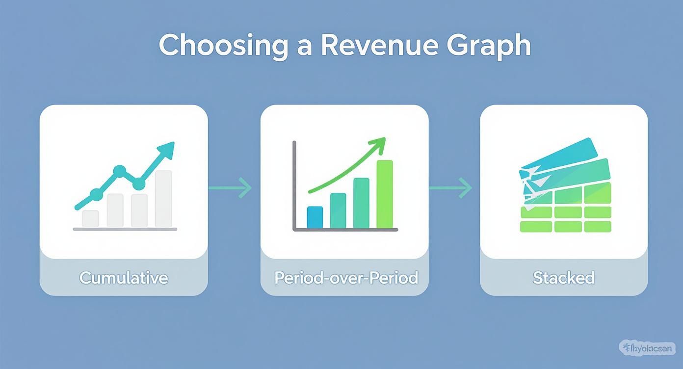
It helps you match the right chart to the business question you're asking. Use cumulative for the big picture, period-over-period for tracking momentum, and stacked charts to understand the composition of your revenue.
How to Visualize Your Revenue Data Effectively

Pulling your revenue data into a total revenue graph is only half the job. The real challenge is making that graph actually say something. A great chart tells a story, turning raw numbers into an insight your whole team can grasp in seconds.
The goal is always clarity. You want a new hire and a board member to glance at your graph and immediately understand the big picture. This means being intentional with every choice, from the axes you pick to the notes you add along the way. Let's dig into the details that make a revenue graph truly shine.
Setting the Stage with the Right Axes
The axes of your graph are the foundation of its story. Get them right, and the trends pop; get them wrong, and you can accidentally hide your most important wins. For most apps, a standard linear scale on the y-axis (revenue) is perfect. It shows absolute growth in a straightforward, intuitive way.
But what if your app is experiencing that "hockey stick" growth everyone dreams of? A linear scale can actually be misleading here, making your incredible early gains look like a flat line. This is the moment to switch to a logarithmic scale. A log scale visualizes the rate of change, so a straight line on the graph means you're seeing consistent exponential growth. It’s the best way to tell if your growth rate is speeding up or slowing down when the numbers get big.
Smoothing Out the Noise to Find the Trend
Daily revenue is naturally chaotic. A slow Tuesday or a holiday weekend can create big spikes and dips that have nothing to do with your app's actual performance. It's easy to overreact—celebrating or panicking—over what's just random noise.
This is exactly why we use data smoothing. By applying a 7-day moving average, you iron out the daily volatility and reveal the real trend underneath.
A moving average simply plots the average revenue over a rolling window—like the last seven days. It acts as a filter, clearing away the daily noise so you can see the true momentum shifts much more clearly.
Think of it like looking at a mountain range. Up close, all you see are jagged peaks and valleys. But from a distance, you see the grand, sweeping shape. A moving average gives you that high-level perspective on your revenue.
Turning Your Graph into a Story with Annotations
Here’s where your graph goes from a simple chart to a strategic tool. An unannotated graph shows what happened—revenue went up. An annotated graph explains why—revenue went up because we launched our new annual plan. Annotations are just simple markers you add to the chart to highlight key events.
Your team should be annotating your revenue graph with every major event, such as:
- Feature Releases: Mark the day a big app update went live.
- Paywall Experiments: Note when you started an A/B test on your paywall. For some great ideas, check out our gallery of high-converting paywalls.
- Marketing Campaigns: Pinpoint the start and end of a major ad spend or influencer push.
- App Store Features: If Apple features your app, mark it! This is almost always a huge inflection point.
These annotations connect your team’s actions directly to their financial impact. This isn't just about internal analysis; it helps place your app's performance in a broader context. For instance, global tax revenue hit an estimated $14.8 trillion recently, with more of it coming from income and consumption taxes. Understanding these larger taxation statistics and revenue trends can add another layer of context to your own performance. Ultimately, annotations transform your graph from a static report into a living record of your business journey.
How to Interpret Your Graph for Actionable Insights
Having a well-built total revenue graph is one thing, but the real magic happens when you know how to read the story it’s telling. This is where you graduate from just looking at numbers to making smart, data-informed decisions that actually move the needle on growth.
Think of your graph as a living document of your app's journey. It’s packed with signals about what’s working, what isn't, and what you should do next. Learning to interpret it means spotting key patterns, asking the right questions, and turning those visual cues into real-world actions for your product and growth teams.
Spotting Key Inflection Points
An inflection point is that moment on your graph where the growth rate visibly changes—it either shoots up or starts to flatten out. These are the most valuable clues on your chart because they almost always line up with something specific you did. Your job is to play detective.
When you see a sudden upward bend, it’s time to ask questions. What did we ship that week? Did we just launch that new marketing campaign? Was our app featured by Apple? By annotating these events directly on your graph, you create a powerful feedback loop that shows the direct ROI of your team’s hard work.
On the flip side, a line that suddenly goes flat is a blaring alarm bell. It’s a signal that something has changed, and you need to figure out what. This is your cue to investigate potential causes—a buggy release, a competitor's big launch, or even a subtle shift in the market.
Analyzing Common Growth Patterns
Your total revenue graph will rarely be a perfect, straight line. Instead, it will fall into a few distinct patterns, each telling a very different story about your business’s health and momentum.
Here are a few common ones you'll see:
- Healthy Linear Growth: The line chugs along up and to the right at a steady, consistent angle. This is the sign of a stable business with predictable revenue.
- Accelerating Growth (The "Hockey Stick"): The curve gets steeper and steeper over time. This is the dream scenario for any startup, signaling exponential growth and fantastic product-market fit.
- Growth Plateaus: The line goes almost completely flat for a while. This usually means you've hit a temporary ceiling—maybe you've saturated your current market, churn is catching up to acquisition, or your features have gotten stale.
- Seasonal Dips and Spikes: You see predictable peaks and valleys that line up with holidays, seasons, or even specific times of the month. Recognizing seasonality helps you plan better and avoid panicking over a dip you should have seen coming.
The shape of your revenue curve is the most honest feedback you'll ever get. A plateau isn't a failure; it's a clear signal from the market that it’s time to innovate, experiment with pricing, or explore new user segments.
A Checklist for Deeper Analysis
When you sit down with your team to review the revenue graph, don't just glance at the overall trend. You have to dig deeper by asking sharp, specific questions that lead to action.
Use this checklist to guide your weekly or monthly review sessions:
- Is our growth accelerating, decelerating, or stable? Compare the slope of the last 30 days to the previous 30. This tells you everything about your current momentum.
- How did our latest feature release impact revenue? Look for a change in the curve right after the ship date. Did it actually move the needle?
- Are there any unexpected dips or spikes? Hunt down the cause of any anomalies. Was there a payment processor outage? A viral TikTok video?
- How does revenue compare to key metrics like active users or downloads? If user growth is soaring but revenue is flat, you likely have a monetization problem, not an acquisition one. It’s the difference between a vanity metric (downloads) and a health metric (revenue).
- What external factors could be at play? Think about holidays, economic shifts, or new App Store policies that might be affecting user spending habits.
By systematically running through these questions, you transform your total revenue graph from a passive report into an active, strategic guide for your entire team.
Got Questions About Your Total Revenue Graph? Let’s Clear Things Up.
Even after you've built the perfect chart, you'll inevitably run into questions once you start digging into the data. A total revenue graph is a powerful tool, but its real value hinges on getting the small details right—especially with financial data.
Let's walk through some of the most common questions and tricky edge cases that product and growth teams run into. Getting these right is what separates a pretty picture from a reliable source of truth that you can confidently use to make decisions.
How Should I Handle Refunds in My Total Revenue Graph?
This one is non-negotiable: accuracy is everything. Refunds should always be subtracted from your gross revenue on the date the refund happened, not the date of the original purchase.
There are two critical reasons for this. First, it keeps your historical data clean and consistent. If you went back and changed past revenue numbers, it would throw off all your trend analysis. Second, it gives you a true snapshot of your net revenue for any given period, showing you precisely when cash flowed out.
In your data query, this usually means joining your main sales table with a refunds table. You'd then calculate your net revenue as SUM(sales) - SUM(refunds) for each day or week. While most monetization platforms like RevenueCat handle this logic for you, it’s a crucial step to remember if you're building a dashboard from scratch.
Should I Use a Linear or Logarithmic Scale?
The right scale for your y-axis completely depends on what you're trying to see in the data, which often comes down to your app's growth stage.
Linear Scale: This is your standard, go-to scale. It's perfect for apps with steady, more predictable growth because it shows the absolute increase in revenue in a way that’s easy for anyone to understand. When you're presenting to stakeholders or the board, a linear scale is almost always the clearest choice.
Logarithmic Scale: Now, if your app is experiencing that "hockey stick" growth, a linear scale can actually hide your progress. It makes the incredible wins from your early days look like a flat line. A logarithmic scale fixes this by showing the rate of change. A straight, upward-sloping line on a log chart means you have a constant exponential growth rate. It’s the best way to see if your growth is actually accelerating or starting to slow down.
Think of it like this: a linear scale shows the dollar-for-dollar gains. A logarithmic scale shows the percentage-based growth. Each tells a different, but equally important, story.
What Is the Best Time Interval for My Graph?
Choosing between a daily, weekly, or monthly view really comes down to what you're trying to accomplish. There’s no single "best" answer, which is why a good dashboard will let you toggle between them easily.
- Daily View: Great for tactical analysis. Want to see the immediate bump from a new feature launch or a weekend marketing campaign? This is your view. The downside is that daily data is often "noisy" and full of random ups and downs.
- Weekly View: This is the sweet spot for most growth meetings. It smooths out the daily noise (often with a 7-day moving average) so you can spot real near-term trends and track momentum without getting sidetracked by a single slow Tuesday.
- Monthly View: This is your high-level, strategic perspective. It's perfect for quarterly planning, board meetings, and long-term forecasting, giving you a clear picture of the business's overall trajectory.
A good rule of thumb is to live in the weekly view for your regular check-ins, then zoom out to monthly for bigger, strategic conversations.
How Can I Compare Revenue from Different User Cohorts?
This is where you graduate from just tracking revenue to truly understanding what drives it. While a standard total revenue graph shows the big picture, a cohort revenue curve gives you much deeper insights into your users' lifetime value (LTV).
Here’s how it works: you group users by when they signed up (e.g., the January cohort, February cohort, etc.). Then, you plot the cumulative revenue each cohort generates over time—Day 1, Day 7, Day 30, and so on.
When you overlay these curves on a single chart, you can instantly see if your product changes are actually making a difference. Is the March cohort's curve steeper than January's? That’s a fantastic sign that your recent updates are getting new users to spend more, and faster. This kind of analysis is usually done in a dedicated cohort tool and is essential for any team that's serious about optimizing LTV.
Ready to stop guessing and start shipping paywalls that convert? Nuxie lets you design, target, and launch high-performance paywalls in minutes, no app updates required. Learn more and start for free at Nuxie.