
ab testing for mobile apps: Growth Guide
Learn ab testing for mobile apps with practical steps, metrics, and examples to boost conversions and user retention.
At its core, A/B testing is a straightforward way to compare different versions of your app—a screen, a button, a whole user flow—to see which one actually performs better. It’s all about swapping out guesswork for hard data, letting your users’ behavior, not your team’s assumptions, guide your product decisions.
Building Your Foundation for Smart App Experiments

Before you dive into a single line of code, you need a solid plan. I’ve seen too many teams jump into ab testing for mobile apps by just throwing random ideas at the wall, and it almost never works. A successful experiment is built on a disciplined process that starts long before the test ever goes live. This groundwork is what turns a simple test into a source of clear, actionable insights that actually move the needle on your most important metrics.
This isn’t a new concept. The idea of randomized controlled trials has been around for ages, but it was the tech giants who really brought it into the digital product world. Google ran its first A/B test way back in 2000. It wasn't perfect, but they stuck with it. By 2011, they were running over 7,000 tests simultaneously. That’s the kind of scale that shows you just how powerful this methodology can be when you get it right.
Crafting a Strong, Testable Hypothesis
Every single great A/B test I've ever seen started with a sharp, well-defined hypothesis. This isn’t just a vague prediction; it's a formal statement that connects a specific change to a measurable outcome and, most importantly, explains why you expect that result.
A rock-solid hypothesis usually follows this format: "If we [make this change], then [this specific metric] will [increase/decrease] because [this is the reason]." Using this structure forces you to clarify the user problem you're trying to solve and the business goal you're targeting.
For example, a weak hypothesis is, "Making the button bigger will get more clicks." It's lazy. A much stronger version is: "If we increase the 'Start Free Trial' button size by 25% and give it more vertical padding, then the trial start rate will increase by 5% because the primary call-to-action will be easier to tap and stand out more on the screen." See the difference? It's specific, measurable, and has a clear rationale.
Before you start building any test, take the time to formalize your hypothesis. A clear hypothesis is the cornerstone of a successful experiment, ensuring you know exactly what you're testing and why. The table below breaks down its essential parts.
Essential Components of a Test Hypothesis
| Component | Description | Example |
|---|---|---|
| The Change | The specific, concrete action you are taking. What are you modifying in the variant? | Change the signup button color from grey to a high-contrast green. |
| The Effect | The measurable outcome you predict will happen as a direct result of the change. | The new user registration rate will increase. |
| The Rationale | The logical reason why you believe the change will cause the effect. This is your underlying assumption. | The call-to-action will be more visually prominent, drawing more user attention. |
Having all three components ensures your test is grounded in strategy, not just random curiosity. A well-built hypothesis makes analyzing the results and drawing meaningful conclusions much easier down the road.
Choosing Metrics That Truly Matter
With your hypothesis locked in, you need to decide how you'll measure success. This means picking your primary and secondary metrics before the test begins.
Primary Metric: This is your north star, the one metric that will officially decide the winner. It has to tie directly back to your hypothesis. If you’re testing a new paywall design, your primary metric might be the trial-to-paid conversion rate. Simple as that.
Secondary Metrics: These are the supporting metrics you’ll watch to catch any unintended side effects. Sometimes a change has ripple effects, both good and bad. That paywall change might boost conversions (your primary metric), but you should also watch for things like an increase in early subscription cancellations—a nasty surprise if you’re not looking for it.
Choosing the right metrics is your best defense against "vanity" wins. It's easy to make a change that increases clicks on a button but ultimately tanks revenue per user. Always anchor your primary metric to a core business objective.
We cover this topic in much more detail in our guide on how to optimize your mobile app.
Defining Your Audience and Sample Size
Last but not least, who is this test for? And how many of them do you need? You have to decide if you're targeting your entire user base or a specific segment, like new users in the United States or returning users who haven't made a purchase. Segmenting your audience can give you much sharper insights.
Calculating your sample size is also non-negotiable if you want to achieve statistical significance. This is the mathematical proof that your results aren't just a fluke. Most A/B testing platforms have calculators for this, but the principle is straightforward: detecting a huge change (like a 50% lift) requires far fewer users than detecting a subtle one (like a 2% lift).
So many teams get impatient here and call a test early. Don't make that mistake. Rushing this step is one of the fastest ways to make bad product decisions based on false positives.
Designing and Implementing Your Test Variants
Now that you have a solid hypothesis and know what you're measuring, it's time for the fun part: bringing your ideas to life by designing the variants. This is where theory gets real, turning into an actual experience for your users.
The key is to create a variation that’s genuinely different from your control (the original version) – different enough to actually change user behavior. But you also need to make sure it still feels like a natural part of your app.
It’s a balancing act, really. You want to be bold enough to learn something useful, but not so out there that you confuse your users or compromise your brand. A classic rookie mistake is testing something too small, like a slightly different shade of blue for a button. These "timid" tests almost never produce statistically significant results, which means you've just wasted a bunch of time and user traffic.
On the flip side, testing a complete redesign of your entire onboarding flow is a bold move, but it's a messy one. It's a multivariate test, meaning you've changed multiple things at once. If that massive redesign "wins," you'll have no idea which specific change—the new copy, the different illustrations, or the reordered steps—was the real hero. For clean results, stick to making one significant, isolated change per test.
From Small UI Tweaks to Big UX Overhauls
The scope of your test can be anything from a tiny visual change to a complete reimagining of a user journey. A mature testing program has a healthy mix of both.
Simple UI Changes: These are usually the easiest to build and can deliver surprisingly big results. Think about testing different copy on a CTA button ("Start Free Trial" vs. "Try for Free"), changing up your icon styles, or making a key element more prominent with a new color. These are fantastic for getting some quick wins and building momentum for your testing program.
UX Flow Modifications: These are a bit more involved but can unlock some serious growth. For example, you could test a three-step signup process against a five-step one. A fitness app might test asking users about their workout preferences before hitting them with the paywall, betting that this small, upfront investment from the user will boost their intent to subscribe.
Paywall Design Experiments: For any subscription app, the paywall is the holy grail of A/B testing. You can test completely different layouts, from a simple list of features to a visually rich design packed with customer testimonials. Another classic test that directly impacts the bottom line is changing the default selected subscription plan (e.g., annual vs. monthly).
The whole point of a variant isn't just to be different; it's to be a clear, testable version of your hypothesis. If you believe a simpler checkout will reduce friction, then your variant should be a masterclass in simplicity—fewer fields, clearer labels, and one unmissable call-to-action.
The interface below from an A/B testing platform shows exactly how you'd set this up, letting you create and manage different variants for an experiment.
This kind of dashboard is your command center, where you can configure multiple variations against the control, decide how much traffic to send to each, and define the key metrics that will crown the winner.
Technical Implementation and Best Practices
Once you've settled on a design, it's time to get it built. Coding your variants efficiently is absolutely critical if you want to test things quickly.
Instead of hardcoding the changes directly into your app, the best practice is to use feature flags or remote configuration variables. Your A/B testing SDK will provide these. This lets you turn variants on and off from a web dashboard without having to ship a new app update—a huge win, especially when you think about how long App Store reviews can take.
For example, to test a new checkout button color, you might create a remote variable called checkoutButtonColor. The control group gets your default hex code, while the variant group gets the new one. In your code, you just read this variable and apply the color. It keeps your code clean and makes managing the experiment a breeze.
Finally, don't let your experiments break your brand. Even though variants are meant to be different, they absolutely must stick to your app's design system—that means using approved fonts, color palettes, and spacing. A variant that looks out of place or "off-brand" can erode user trust and pollute your test results.
Always get a final design review before a variant goes live. This little bit of discipline ensures your experience, while different, still feels authentic. It’s how you make sure your ab testing for mobile apps program builds long-term value without damaging the user experience you've worked so hard to create.
Choosing Your A/B Testing Architecture
Picking the right technical setup for your A/B tests is one of the most important decisions you'll make. This isn't just an engineering detail—it's a strategic move that determines how flexible, fast, and powerful your entire optimization program will be.
Your choice between client-side and server-side testing dictates how quickly you can launch experiments, what kind of tests you can run, and how much control you have over the user experience. Let's dig into the practical differences to figure out which approach is the right fit for your app and your team.
Client-Side Testing: The Fast Path to Visual Changes
Client-side testing is often the starting point for teams new to A/B testing for mobile apps. The process usually involves integrating a lightweight SDK into your app, which then takes care of fetching experiment rules and showing the correct variant directly on the user's device.
This approach is fantastic for making quick, visual changes. Want to test a new button color, tweak some headline copy, or swap out an image on your onboarding screen? A client-side solution is your best friend. It empowers product managers and marketers to make these changes through a visual editor or a simple dashboard, often without needing to pull in developers for every little test. For a look at how straightforward this can be, our guide on how to integrate our iOS SDK walks through a typical setup.
But this simplicity does have its trade-offs. The SDK needs to make a network request to figure out which experiment to show, which can sometimes create a "flicker"—that split second where a user sees the original version before the test variant loads. On a slow connection, this can be a real drag on the user experience.
Server-Side Testing: For When You Need More Power
Server-side testing puts your engineering team in the driver's seat, giving you maximum control and performance. Instead of the logic living in the app, the decision of which variant to show is made on your backend before the content ever reaches the user's device.
This architecture is the only way to go when you're testing complex, non-visual changes that are core to your app's functionality.
- Algorithmic Changes: Experimenting with a new search algorithm or a different product recommendation engine.
- Feature Flagging: Safely rolling out a major new feature, like a completely redesigned checkout flow, to a small group of users first.
- Pricing and Business Logic: Testing different subscription tiers or promotional offers that need to be validated on your backend.
Because the decision is made on the server, there's absolutely no flicker effect, which creates a seamless, native experience for the user. The main downside? It requires more upfront backend development to set up and manage these experiments.
This diagram helps visualize how the scope of your test should guide your choice.
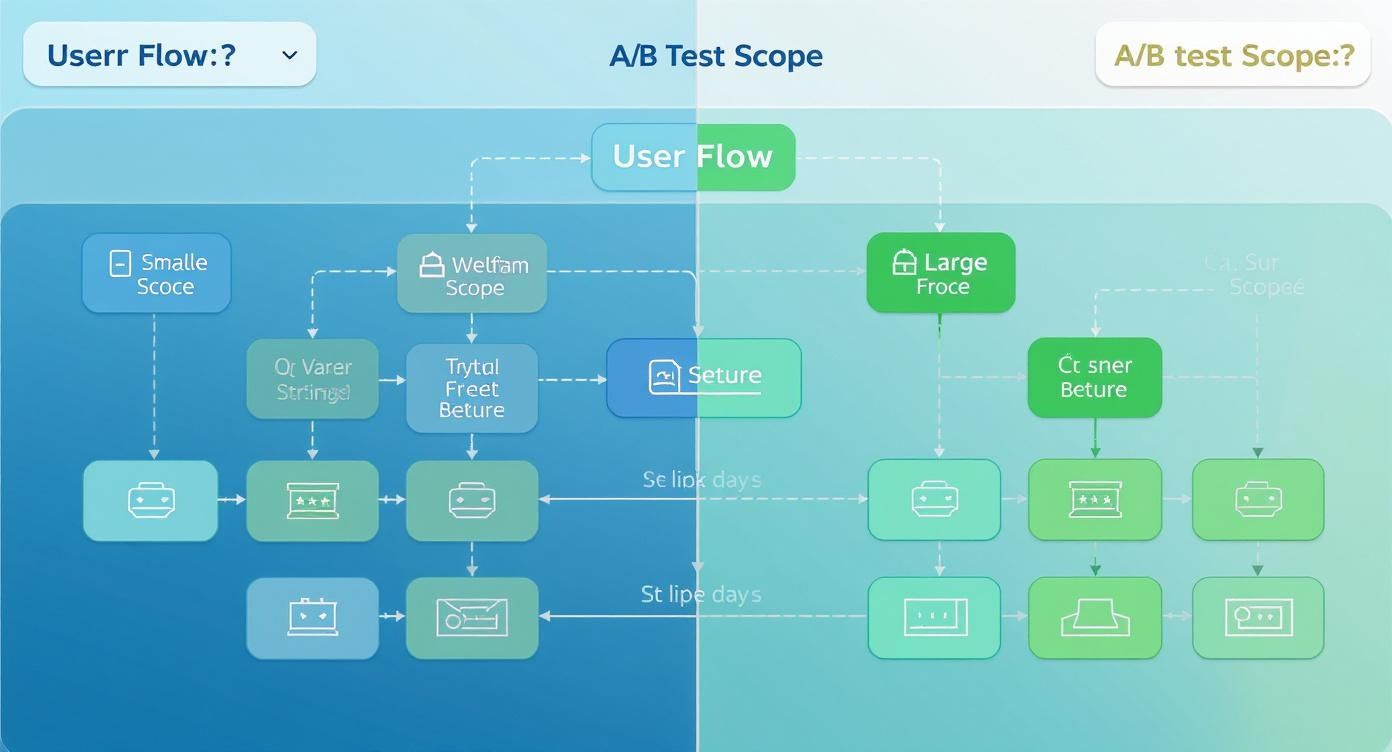
As you can see, smaller visual tweaks are a natural fit for client-side tools, while bigger, more fundamental changes to your app's logic or user flow are better handled on the server.
Client-Side vs. Server-Side A/B Testing for Mobile Apps
To make the decision even clearer, here’s a practical comparison to help you choose the right testing architecture based on your app's needs and technical resources.
| Factor | Client-Side Testing | Server-Side Testing |
|---|---|---|
| Best For | Visual UI/UX changes (copy, colors, layouts) | Complex features, algorithms, pricing logic |
| Speed to Launch | Faster. Non-technical teams can often launch tests. | Slower. Requires backend development and release cycles. |
| Performance | Can introduce "flicker" or slight latency. | No performance impact. Seamless user experience. |
| Complexity | Low. Typically managed via a dashboard. | High. Requires engineering resources to implement. |
| Offline Support | Limited without on-device decisioning. | Fully supported; logic is on the server. |
| Control | Less control over deep app logic. | Full control over the entire user experience. |
Ultimately, there's no single "best" answer. The right choice depends entirely on what you're trying to test and the resources you have available.
The Best of Both Worlds: Hybrid Models and On-Device Decisioning
The good news is you don't always have to pick just one. Many sophisticated teams run a hybrid model, using client-side tools for rapid UI iterations while relying on server-side testing for deeper, more complex experiments. This approach gives you speed for marketing-driven tests and power for core product changes.
A key innovation, especially for mobile, is on-device decisioning. This is a game-changer. Instead of the SDK calling a server every time a user opens the app, it downloads the entire set of experiment rules in the background. The decision of which variant to show happens instantly on the device itself.
This completely eliminates network latency and the flicker effect. Even better, it ensures your tests run flawlessly when the user is offline—a massive advantage for mobile apps, where connectivity is never a guarantee.
Key Takeaway: For mobile apps, an architecture that supports on-device decisioning is a huge win. It delivers an instant, flicker-free experience that protects your app's performance and ensures experiments are always running, no matter the network conditions.
Despite its power, mobile A/B testing is still playing catch-up to the web. As of 2025, only about 44% of companies have adopted A/B testing software, showing just how much opportunity is still on the table. Hurdles like app store approval cycles and performance concerns have historically held teams back. But modern SDKs and hybrid solutions are built to overcome these exact challenges, enabling faster iteration and reliable data capture, even offline.
Running and Monitoring Your Live Experiment

The moment of truth has arrived—you’re ready to launch. Hitting that “go live” button is exhilarating, but the real work is just beginning. The most experienced product teams know that the initial rollout is a delicate phase that demands caution and vigilance. The last thing you want is a "successful" test that boosts one metric while quietly torpedoing the overall user experience.
A phased rollout isn't just a good idea; it's non-negotiable for protecting your app's health. Forget flipping the switch for 100% of your target audience right away. Start small. Exposing the experiment to just 1% to 5% of users acts as your safety net, giving you the chance to spot catastrophic bugs or severe negative impacts before they can affect everyone.
Think of this initial, low-exposure period as a shakedown cruise. It's your chance to confirm the experiment is firing correctly from a technical standpoint and, more importantly, that it isn't causing any unintended harm.
Monitoring Key Metrics in Real Time
Once your test is live, even with a small fraction of users, you need to be glued to your dashboards. Your goal here isn't to declare a winner; it's to make sure nothing is on fire. You'll want to keep a close watch on two distinct categories of metrics.
The first category includes the primary and secondary success metrics you defined earlier. You should see data trickling in for these, but resist the urge to jump to conclusions. Early results are notoriously volatile and can be incredibly misleading.
The second, and initially more critical, category is your guardrail metrics. These are the vital signs of your app's health. A sudden, negative spike in any of these is a bright red flag that demands your immediate attention.
- Crash Rates: Is one of your variants causing the app to crash more than the control?
- App Latency: Are load times for critical screens noticeably slower for users in the variant group?
- Customer Support Tickets: Are you seeing an influx of complaints that seem related to the new feature?
- Uninstalls: A dramatic increase here is a five-alarm fire.
If a guardrail metric tanks, don't hesitate to pause the experiment immediately. A 2% lift in conversions is completely worthless if it comes at the cost of a 10% increase in app crashes. Protecting the core user experience is always priority number one.
Once you’ve confirmed the test is stable and not causing damage, you can start to gradually increase the traffic allocation. A typical ramp-up might look something like this: 5% -> 25% -> 50% -> 100%, with careful monitoring at each stage before you proceed to the next.
The Power of Analyzing by Segment
Watching your overall metrics is crucial, but the richest insights are almost always found by digging deeper. This is where segmentation becomes your secret weapon in ab testing for mobile apps. Analyzing results across different user groups can reveal hidden patterns that you would otherwise completely miss.
What works for a brand-new user might fall flat with a long-time power user. For instance, a simplified onboarding flow could be a huge win for trial starts among new users, but it might just annoy returning users who are trying to get straight to their accounts. If you only looked at the overall average, these two opposing effects could cancel each other out, leading you to incorrectly conclude the test had no impact at all.
Consider slicing your results by segments like:
- New vs. Returning Users: This is a classic split that often uncovers surprising insights.
- Geographic Location: User behavior and preferences can vary dramatically by country or region.
- Device Type: Does the change perform differently on a new iPhone 15 versus an older iPhone SE?
- Acquisition Channel: Users who found you through organic search may behave very differently from those who came from a paid social media ad.
This level of analysis transforms a simple "win or lose" experiment into a powerful learning opportunity. By understanding who responded well and why, you can refine your product strategy with much greater precision. To get started, diving into how segments and events work can give you a strong foundation for setting up this kind of detailed analysis.
Analyzing Results to Make Better Decisions
https://www.youtube.com/embed/KZe0C0Qq4p0
You’ve done the hard work, you've patiently collected data for days or weeks, and now it's time for the payoff. This is where all that effort turns into real, measurable value for your business. But interpreting A/B test results isn’t as simple as picking the variant with the most clicks. It takes a disciplined eye to tell the difference between a genuine user insight and just random statistical noise.
The entire mobile app world is leaning heavily on this kind of data-driven thinking. In fact, the market for ab testing for mobile apps is on track to be worth nearly $2.5 billion by 2025. That explosion is driven by one simple truth: the most successful apps are the ones that relentlessly refine their user experience to drive conversions. You can find more data on this expanding market and its projected growth.
Understanding Statistical Significance
First things first, you have to get comfortable with statistical significance. In simple terms, it's how you measure your confidence that the results you're seeing aren't just a coincidence. Most A/B testing platforms handle the heavy lifting here and usually show it as a percentage, like 95% significance.
So, if your test hits that 95% mark, it means there's only a 5% chance that the difference you saw between your control and the new variant was a fluke. It’s the proof you need to say, "Yes, the change we made actually caused this outcome."
I can't stress this enough: never, ever call a winner before your test has reached its target sample size and statistical significance. Peeking at results early is the single biggest mistake teams make. It’s a surefire way to get a false positive, leading you to ship a "winner" that does nothing... or, even worse, tanks your metrics down the line.
Interpreting the Numbers
Once you have a result you can trust, the real analysis begins. The data is telling you a story about your users, and your job is to listen carefully. This means looking beyond your primary success metric to understand the full impact of your experiment.
You'll run into a few common scenarios, and here's how I've learned to handle them:
A Clear Winner: This is what we all hope for. Your variant crushes your main goal (like increasing trial starts) and doesn't hurt any of your other important metrics. When this happens, the decision is easy. Pop the champagne and roll out the winning variant to 100% of your users.
An Inconclusive Result: Sometimes, a test finishes and there’s no significant difference between the variants. Don't think of this as a failure—it's actually a huge win. You've just learned that the change you proposed wasn't meaningful enough to sway user behavior. That insight is incredibly valuable because it stops you from shipping a useless feature that just adds clutter.
A Mixed Result: This is where things get tricky, and where you really earn your paycheck. Your variant might boost your primary metric (say, trial starts go up) but ding a secondary one (like day 7 retention drops). This isn't a stats problem; it's a business decision. You have to weigh the trade-offs. Is a 5% lift in trials worth a 2% dip in retention? There's no textbook answer—it all comes down to your company's strategic goals.
Documenting and Sharing Your Findings
The final, crucial step is to turn your results into institutional knowledge. Don't just ship the winner and immediately jump to the next test. You need to document everything in a place where your whole team can find and learn from it.
A good experiment summary should always include:
- The Hypothesis: What did you originally believe would happen, and why?
- The Result: A clear, concise summary of the data, including how the primary and secondary metrics performed and the statistical significance.
- The Decision: What did you do? Did you roll it out, roll it back, or decide you needed another iteration?
- The Learnings: What did this experiment teach you about your users' behavior or preferences?
When you share these findings far and wide, you start building a true culture of optimization. It gets everyone, from marketing to engineering, thinking about the user. This learning loop is what turns ab testing for mobile apps from a simple tactic into a powerful engine for long-term, sustainable growth.
Common Mobile A/B Testing Questions Answered
As you start running more experiments, a few practical questions almost always bubble up. Getting these right is the difference between a smooth, effective optimization program and one that just spins its wheels. Let's walk through the questions I hear most often from product and growth teams who are in the trenches.
How Long Should I Run an AB Test on My Mobile App?
The honest, albeit unsatisfying, answer is: it depends. The right duration comes down to a blend of your app's daily traffic and the size of the change you’re expecting to see. The ultimate goal is to collect enough data to reach statistical significance, a calculation that any decent testing platform will handle for you.
A crucial rule of thumb is to always run experiments for full weekly cycles. User behavior on a Tuesday morning can be completely different from a Saturday night. By running a test for at least one full week—or even better, two full weeks (14 days)—you smooth out those daily ebbs and flows and get a much more reliable picture of the actual impact.
Apps with lower traffic might need to run for several weeks to get a clear signal, while an app with millions of daily users could see conclusive results in just a few days. The golden rule here is to resist the urge to stop a test early just because one variant is shooting ahead. This is a classic blunder called "peeking," and it's one of the fastest ways to get fooled by a false positive.
Never call a winner based on early, noisy data. Trust the math and let the experiment run to its predetermined sample size. Patience is what separates reliable results from wishful thinking.
What Are the Biggest Mistakes to Avoid in Mobile AB Testing?
Even experienced teams can fall into a few common traps. Just knowing what they are is the first step to sidestepping them and making sure your hard work actually pays off.
Here are the top mistakes I see time and time again:
- Testing too many things at once. If you change the headline, the button color, and the main image all in one variant, you’ll have no clue which element actually caused the lift (or the drop). For clean, actionable results, you need to isolate one significant change per test.
- Forgetting about guardrail metrics. Sure, a new paywall design might boost your trial start rate by 10%, which sounds fantastic. But what if it also increases app crashes by 5%? That’s a net loss. Always monitor core health metrics like stability, latency, and user retention alongside your primary goal.
- Starting without a clear hypothesis. Just throwing ideas at the wall to see what sticks is a recipe for ambiguous results that teach you nothing. A strong hypothesis ("If we change X, then Y will happen, because of Z") grounds your experiment in a clear learning objective.
Can I Run Multiple AB Tests at the Same Time?
Yes, you absolutely can, but you have to be smart about it to avoid what we call interaction effects. This is when two different experiments accidentally interfere with each other, muddying the results of both.
If your tests live in completely separate, isolated parts of your app, the risk is incredibly low. For instance, running an experiment on your onboarding flow and another one on the settings screen is generally safe, since the user journeys rarely overlap.
The trouble starts when two experiments could influence the same user path—like testing a new homepage banner and a different checkout button at the same time. A user might see both changes, and you'd have no way of knowing which one actually influenced their decision to buy.
The standard solution for this is to create mutually exclusive experiment groups. This setup ensures that any single user is only exposed to one of the potentially interacting tests at a time, keeping your data clean and your results trustworthy.
How Do I Handle AB Testing with App Store Release Cycles?
This is probably one of the biggest headaches that separates web and mobile testing. You can't just push a change live whenever you want; you're on a schedule dictated by Apple and Google.
This is where server-side A/B testing really shines. It gives you the power to enable, disable, and tweak experiments from your backend without having to submit a new app version for review. The flexibility this gives you is immense.
If you’re using a client-side tool, a great strategy is to bundle several potential experiments into a single app release. You can code multiple variants for different tests but ship them in a dormant state. Then, you can use your A/B testing platform's dashboard to remotely activate, pause, and stop these tests as needed, giving you the power to iterate between your scheduled app store updates.
Ready to stop guessing and start growing? Nuxie gives you the power to design, target, and ship high-converting paywalls in minutes, not weeks—all without waiting for app store approval. Learn more and start your free plan today.