Optimize Your Mobile Onboarding Flow for Activation &
Design a mobile onboarding flow for app & game teams. Drive activation & revenue with our guide on KPIs, UX patterns, A/B testing, and cross-platform
Onboarding is still often discussed like it's a UX artifact. A few slides. A tooltip tour. A sign-up form and a permission prompt.
That framing is too small.
The first session is where activation, personalization, permissioning, and early monetization all collide. It's also where mobile products lose an enormous amount of users. Business of Apps reports that Day 1 retention was 22.6% for Android and 25.6% for iOS in Q3 2022, which means roughly three-quarters of users don't come back after the first day according to Business of Apps onboarding benchmarks. If you run a subscription app, a game, or a utility product, that should change how you think about your mobile onboarding flow.
The practical implication is simple. Onboarding isn't a screen set. It's your first growth system. Product owns the experience, engineering owns reliability, design owns clarity, growth owns experiments, and data owns the feedback loop. If those functions operate separately, the flow usually becomes slow, generic, and hard to improve.
Defining the Modern Mobile Onboarding Flow
A modern mobile onboarding flow is the connected journey between install and first real value. Sometimes that includes a welcome screen. Often it includes branching questions, contextual education, sign-up choices, entitlement-aware screens, and the first monetization moment. In games, it may include a tutorial, an early reward, and a store introduction. In subscription apps, it may include intent capture, a personalized value screen, and a paywall.
Nielsen Norman Group defines onboarding as dedicated flows and UI elements used to familiarize users with a new interface, and notes common components such as feature promotion, customization, and instructions. That framing matters because it keeps teams from reducing onboarding to a tutorial when the actual job is activation.
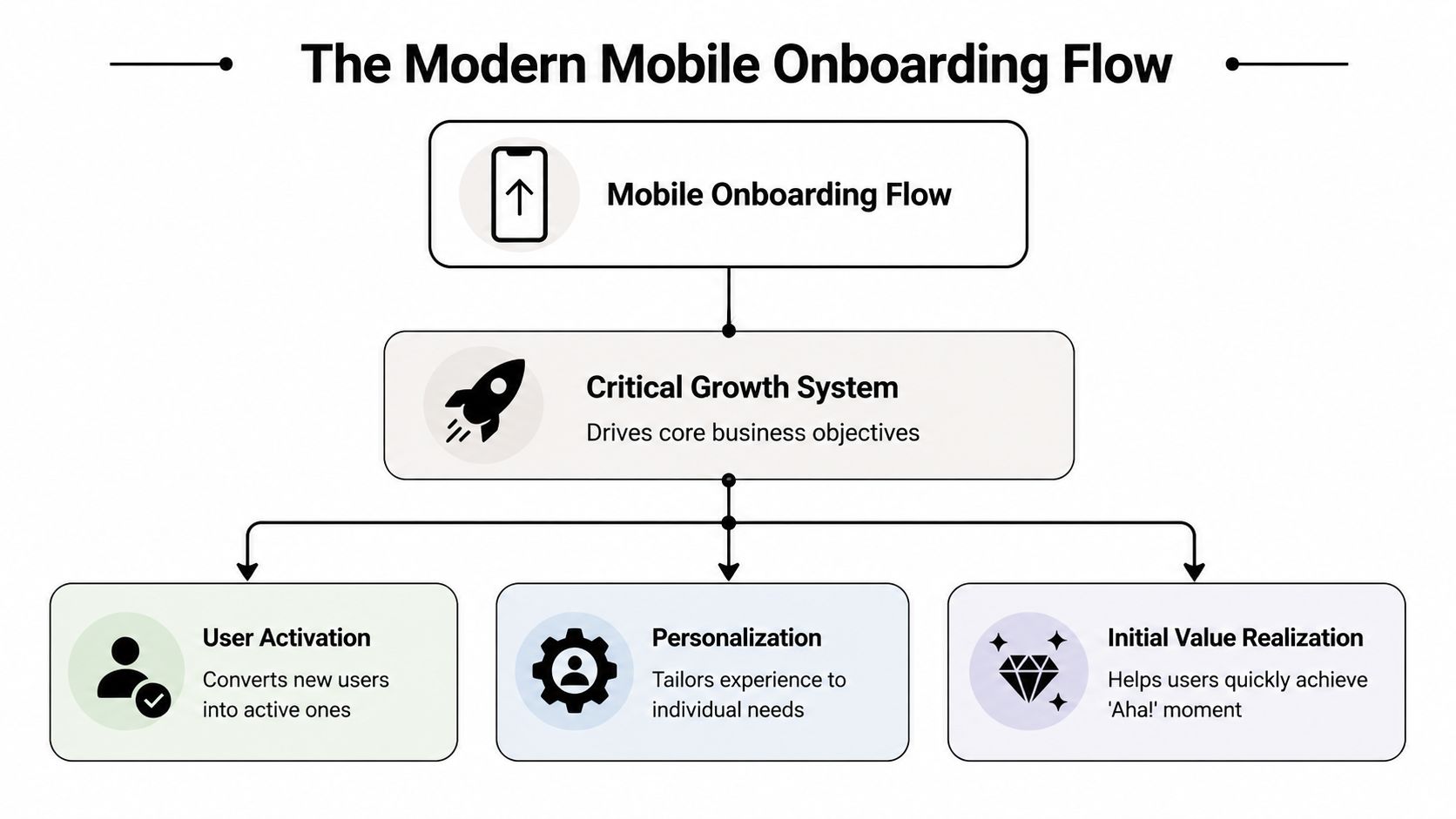
The three jobs onboarding has to do
A useful way to scope onboarding is to force every screen to justify itself against one of three jobs:
- Show core value quickly. Users need to understand what the app helps them do, not just what features exist.
- Collect only the input that changes the experience. Goal, state, role, or preference questions are useful when they drive the next screen, recommendation, or offer.
- Create a first win. That could be finishing a workout plan setup, completing a first task, entering a first match, or accessing a personalized home screen.
If a screen doesn't support one of those jobs, it probably belongs later.
Practical rule: Treat onboarding as part of the activation funnel, not as pre-product decoration.
The KPIs that actually matter
Teams often overfocus on completion rate. Completion matters, but a fast completion rate for a weak flow can still produce poor retention or poor trial quality.
A stronger measurement set includes:
- Start rate. How many new users begin the flow.
- Completion rate. Which steps users finish and where they abandon.
- Time to first meaningful action. How long it takes to reach the first behavior that predicts value.
- Response distribution. Which onboarding answers users choose, and whether those segments behave differently later.
- Trial start rate and purchase conversion. Especially important for subscription products.
- D1 and D7 retention. The cleanest check on whether the flow created a durable first impression.
Teams that want a more connected stack usually end up evaluating an in-app experience platform because onboarding now spans messaging, experimentation, analytics, and monetization logic, not just UI delivery.
What changes when you adopt this view
The workflow changes immediately. You stop asking “what should the welcome screens say?” and start asking:
| Question | Why it matters |
|---|---|
| Which user states require different paths? | A generic flow usually underperforms against a relevant one. |
| What is the first meaningful action? | It anchors the whole sequence. |
| Which prompts can wait? | Early friction compounds quickly. |
| Which events need instrumentation? | You can't fix step-level drop-off if you can't see it. |
That's the difference between a static intro and a mobile onboarding flow built to influence retention and revenue.
Designing a High-Converting Onboarding Experience
The highest-converting onboarding experiences are rarely the ones with the most screens. They're the ones where every screen earns its place.
Nielsen Norman Group's guidance is a good baseline: onboarding should use progressive disclosure, most mobile apps don't need heavy instructional onboarding, and when instruction is necessary it should stay short and unobtrusive, as outlined in Nielsen Norman Group's mobile onboarding guidance. That aligns with what works in practice. Long explanation-heavy sequences usually underperform contextual guidance and sharper transitions into the product.
Start with outcome, not feature inventory
Teams often write onboarding from the inside out. They know the product too well, so they explain navigation, tabs, settings, and capabilities in the order engineering built them.
Users don't care about that sequence. They care about outcome.
A better opening pattern is benefit-oriented. A fitness app should talk about the plan a user will get. A finance app should focus on the result of better visibility or control. A puzzle game should get the player into a satisfying core interaction quickly. If you need to explain a novel gesture or mechanic, do it right before that action, not three screens earlier.
Use branching logic sparingly
Personalization helps when it changes what users see next. It hurts when it becomes a survey.
The most reliable branching model is goal plus state:
- Goal. What is the user trying to achieve?
- State. What context are they in right now?
That framework keeps questions useful. A fitness app might branch users by weight loss, strength, or recovery. A productivity app might branch solo users and team users. A subscription app might suppress a purchase prompt if the user already has an active entitlement.
Users notice when onboarding feels like part of the app instead of a generic funnel. They also notice when there are too many questions before value.
Write microcopy that removes doubt
Small copy changes affect whether a flow feels clear or suspicious. The best onboarding microcopy does three things:
- Explains the next step in plain language.
- Sets expectations when there's effort involved.
- Tells users why a question matters.
For example, “Choose your goal so we can tailor your plan” is better than “Select an option.” It connects action to outcome. The same applies to sign-up, notifications, and paywall transitions.
If your team is refining these moments, disciplined user testing for apps is one of the fastest ways to catch where users hesitate, misread intent, or feel like the flow turns into a funnel too early.
A practical design checklist
Use this list before you ship:
- Trim instructional screens. If the interface is obvious, let users explore.
- Move questions later unless they power the next screen. Curiosity isn't enough.
- Keep one clear CTA per screen. Competing actions slow decisions.
- Make skip behavior explicit. Non-essential setup shouldn't trap users.
- Match the visual language of the core app. Onboarding shouldn't feel outsourced.
- Design for speed. Lag, jank, and delayed assets break trust fast.
A high-converting mobile onboarding flow feels conversational, but it's built with discipline. Fewer prompts. Better timing. Clearer reasons.
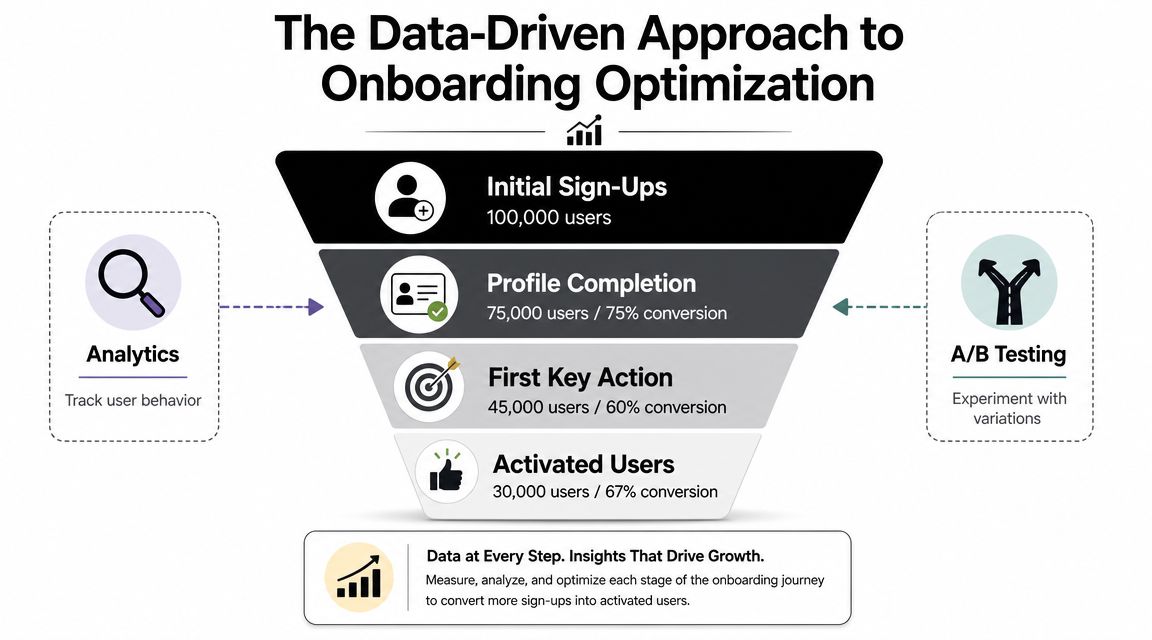
The Data-Driven Approach to Onboarding Optimization
Teams don't improve onboarding by debating opinions longer. They improve it by treating the flow like a measurable funnel.
Industry guidance recommends tracking onboarding funnels, measuring drop-off step by step, and A/B testing variants because even small friction points in forms, permissions, or explanation-heavy screens can suppress activation, as described in Sendbird's mobile onboarding best practices.
A visual funnel helps align product, engineering, and growth on what's happening:
Instrument the flow at screen and decision level
At minimum, track:
- Flow exposure
- Screen view
- Button tap
- Skip action
- Answer selected
- Step completed
- Permission prompt shown
- Trial started
- Purchase completed
- Entitlement state at exposure
That event model does two things. It shows where people leave, and it tells you which branch or treatment produced higher-quality users later. Without both, you end up optimizing for completion while hurting monetization or retention.
The video below walks through the experimentation mindset that matters here.
Test structure, not just cosmetics
Weak experiments ask whether button color A beats button color B. Useful experiments change decision structure.
One of the more valuable tests for subscription products is whether to ask intent or preference questions before the first monetization moment. Instead of sending every user to one generic paywall, you can branch into different value screens and offers based on what they said they want. The important part is not claiming a win based on paywall tap-through alone.
Measure by variant across:
| Metric | What it tells you |
|---|---|
| Onboarding completion | Did the flow create too much friction? |
| Time to first action | Did users get to value faster? |
| Trial start rate | Did the paywall timing and framing work? |
| Paid conversion | Did the acquired user quality hold up? |
| Revenue per exposed user | Did the variant improve actual business outcome? |
A clean onboarding test doesn't stop at the paywall. It follows the user into activation, subscription state, and downstream revenue.
Build a repeatable experimentation loop
A practical loop looks like this:
- Identify one high-friction point. Usually a question cluster, account gate, permission moment, or monetization transition.
- Write a narrow hypothesis. Example: delaying a preference question until after first value may improve activation without reducing purchase intent.
- Define guardrail metrics. Don't let completion gains hide weaker monetization or retention.
- Ship the test with remote control. Faster iteration beats bundling experiments into app releases.
- Review by segment. New users aren't one group. Goal and state often change the outcome.
Teams usually hit a tooling limit here. Traditional analytics can track the events, and paywall tools can test the offer, but the connection between quiz answers, experiment assignment, entitlement state, and in-app screens often gets stitched together manually. That's why teams explore tools like A/B testing for mobile apps and broader in-app experimentation systems instead of isolated point solutions.
Onboarding Examples for Apps and Games
The theory gets clearer when you map flows to real product shapes.
Subscription fitness app
A strong fitness onboarding flow starts with intent, not account creation. The first question is usually goal-based. Lose weight, build strength, improve recovery, or build consistency. The second layer is state. Beginner or experienced, home workouts or gym, short sessions or longer plans.
That combination changes the next screen. Users should see a value story that matches what they just said. Someone focused on recovery should not get the same framing as someone training for strength. The trial or purchase prompt can then reflect that context, with plan language, imagery, and outcomes aligned to the selected path.
The common failure mode is asking too many setup questions before any sense of progress. A better flow uses only the inputs needed to shape the first plan and defers profile depth until later.
Productivity app
Productivity products often need to separate solo from team use early. The mistake is assuming those users share one onboarding path.
A solo user usually needs quick setup, a first project, and a visible productivity win. A team user may need invite flows, workspace context, and collaboration cues. If you send both groups through the same sequence, one segment gets irrelevant screens and the other misses key setup steps.
A practical branch is:
- solo users into first-task creation and lightweight templates
- team users into workspace naming, invite timing, and collaboration examples
The monetization logic may differ too. A team-oriented user might respond better to a value screen tied to collaboration outcomes, while a solo user may convert better after completing a personal workflow.
Mobile game
Games need a different balance. The player has to feel the core loop fast. That usually means an interactive tutorial, but not a lecture.
The best mobile game onboarding flows teach one mechanic at a time through actual play. Tapping, dragging, attacking, matching, or upgrading should happen inside the game state, with skippable guidance where possible. Experienced players hate forced slowdown. New players need enough structure to avoid confusion.
The monetization moment also needs timing discipline. Early store exposure can work if the player already understands the reward loop. It backfires when the player hasn't yet felt mastery, progression, or reward relevance.
Across all three examples, the pattern stays consistent. Ask only what changes the next experience. Deliver a first win quickly. Introduce monetization after relevance is established, not before.
A Cross-Platform Implementation Guide
Onboarding gets harder when your product spans iOS, Android, React Native, Flutter, Unity, and Unreal. The UX problem becomes an architecture problem.
Native teams often start by hardcoding the flow in SwiftUI and Jetpack Compose. That gives strong platform fidelity, but every copy change, branch update, or experiment can turn into engineering work and release coordination. Cross-platform teams reduce some duplication, but they still face the same core question: is onboarding a fixed app feature or a remotely configurable system?
Industry research points in the same direction. Onboarding is increasingly treated as a measurable growth system, and Airship reports that apps running onboarding campaigns see new users opt into push 22% faster than apps that do not, as cited in Appcues' guide to mobile onboarding UX. That kind of downstream impact is hard to capture if every iteration requires a rebuild and store review.
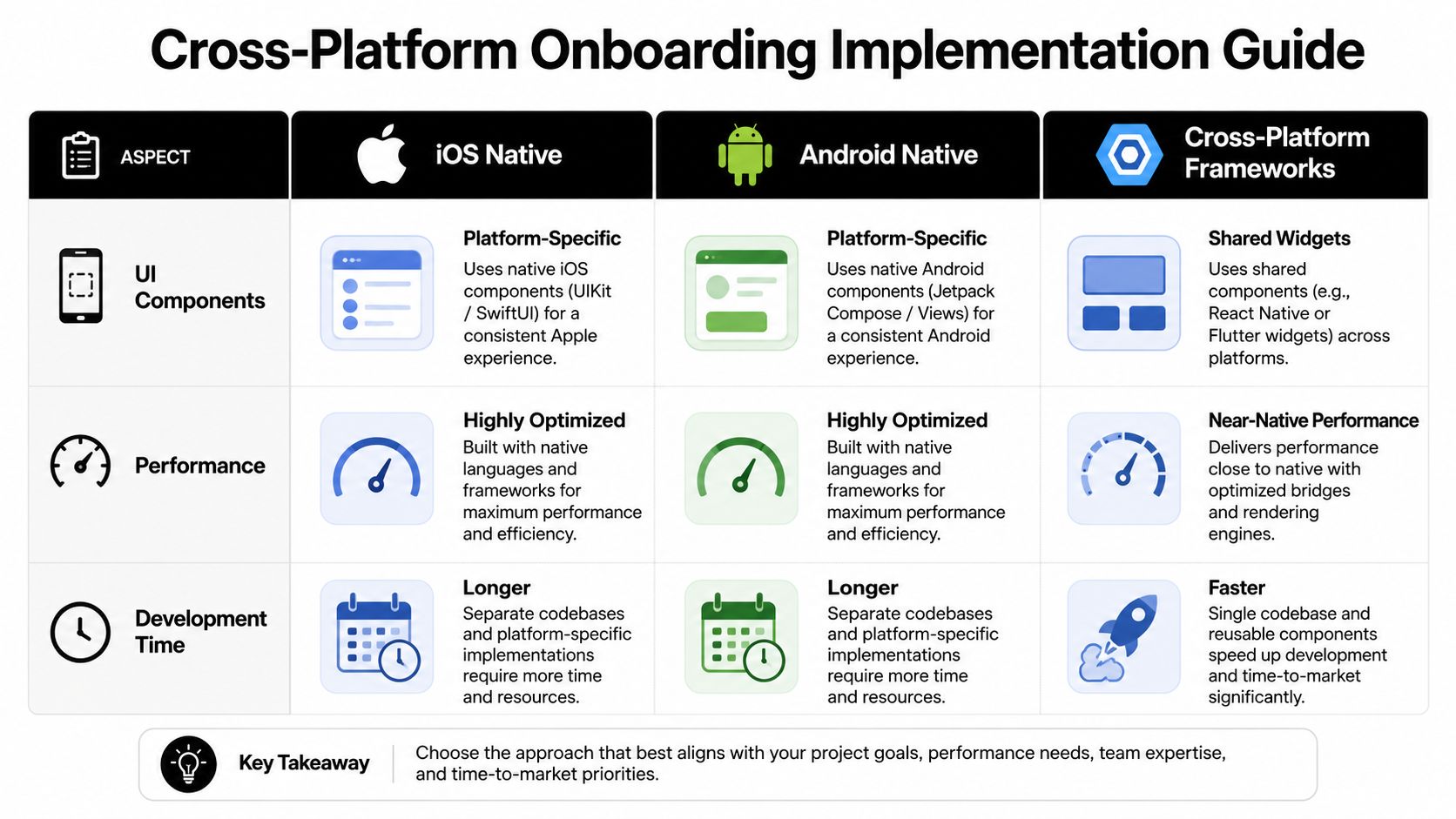
Native versus shared implementation
Here's the trade-off in plain terms:
| Approach | Strength | Cost |
|---|---|---|
| iOS native | Tight platform feel, deep OS integration | Separate implementation and release cycle |
| Android native | Strong Compose control, device-specific tuning | Duplicate logic across teams |
| React Native or Flutter | Shared UI and faster alignment | Plugin and bridge complexity for some flows |
| Unity or Unreal | Full control in game environments | Tooling fragmentation around analytics and offers |
If your onboarding rarely changes, hardcoding can be fine. If product, growth, and monetization teams need to iterate weekly, it becomes a bottleneck quickly.
What a durable architecture looks like
A reliable mobile onboarding flow architecture should separate presentation, targeting, experiment assignment, and business state.
That means:
- Screens are remotely configurable instead of embedded in releases
- Branching rules can use answers, events, timing, and entitlement state
- Analytics are first-class so every exposure and answer is attributable
- Monetization logic can react to subscription state, trial eligibility, and billing data
- Fallbacks exist offline so flows don't break on weak networks
A connected platform offers a useful solution. Nuxie is one option for teams that want to design, experiment with, and remotely ship onboarding and other in-app experiences across iOS, Android, React Native, Flutter, Unity, and Unreal from one system, while also connecting analytics, billing, purchase data, and entitlement state without a revenue-share fee on billing and entitlement data.
Implementation notes by stack
A few practical notes matter regardless of framework:
- SwiftUI and Jetpack Compose work well when flow logic is thin and stable.
- React Native and Flutter benefit from a shared flow schema so product changes don't fork behavior by platform.
- Unity and Unreal need special care around performance, asset delivery, and making growth surfaces feel native to the game loop.
- All stacks need a source of truth for entitlement state, offer eligibility, and experiment assignment.
The implementation mistake is letting every platform solve onboarding independently. That usually creates metric drift, inconsistent segmentation, and slower learning.
Common Onboarding Pitfalls to Avoid
Most broken onboarding flows fail in familiar ways. The screen design may look polished, but the system underneath is brittle or mis-sequenced.
Too many questions before value
The easiest way to kill momentum is to front-load curiosity questions that don't change anything. Users will answer a few high-signal questions if the next screen clearly reflects what they said. They won't tolerate a long intake form disguised as personalization.
Fix it by auditing every question. If removing it doesn't change the next experience, remove it or defer it.
Permission prompts with no context
Permissions can help activation, but bad timing makes them feel extractive. If the user hasn't seen value yet, the prompt reads as a demand, not a trade.
Pre-prompt context often helps. Explain what the permission enables, then ask at a moment where the benefit is obvious. The exception is when your own testing and platform strategy support a different sequence for a specific permission.
If a permission request feels like an interruption, the timing is probably wrong.
Generic monetization paths
One paywall for every new user is operationally simple, but it leaves relevance on the table. A user who wants recovery guidance, team collaboration, or a faster game progression path should not get the same framing by default.
The fix isn't endless branching. It's a small number of meaningful paths tied to goal, state, and entitlement.
Hardcoded flows that nobody can update quickly
This one shows up inside engineering calendars. Product wants to test copy, design wants to tune sequence, growth wants a new branch, and the answer is “next release.” That delay compounds because weak onboarding doesn't stand still while you wait.
Use a setup where teams can update content, logic, and experiments remotely, while still preserving guardrails, QA, and platform consistency.
Onboarding that doesn't feel like the product
Users can tell when onboarding is a bolted-on funnel. Visual mismatch, lag, weak animations, and abrupt transitions all signal that the flow was optimized around extraction instead of experience.
The solution is simple to describe and harder to execute. Make onboarding fast, polished, relevant, and integrated with the live app state. If it feels native to the product, users are more likely to trust the next step.
Build Your Onboarding Flow as a Growth Engine
A strong mobile onboarding flow does more than orient users. It moves them into value, gives the product enough context to personalize intelligently, and creates the conditions for retention and revenue.
That requires a broader operating model than is initially typical. Design has to think in branches, not just screens. Product has to define the first meaningful action. Engineering has to support remote control and reliable eventing. Growth has to test structure, not just polish. Data has to connect onboarding behavior to subscription and retention outcomes.
The payoff is strategic. When onboarding becomes measurable and configurable, teams stop shipping one-time intros and start building a system that improves over time.
That's the shift that matters. Not better welcome screens. Better activation infrastructure.
If your team wants to build onboarding, paywalls, surveys, retention moments, and entitlement-aware in-app journeys from one system, Nuxie is built for that cross-platform workflow across iOS, Android, React Native, Flutter, Unity, and Unreal. It gives product, growth, and engineering teams a shared way to ship experiments, connect analytics to monetization, and update in-app experiences without waiting on every app release.