A Guide to App Pricing and Packaging That Actually Works
Discover how to master app pricing and packaging. Learn to design tiers, build high-converting paywalls, and use data to boost revenue.
Getting your pricing and packaging right is all about matching your app's value to what different groups of users are willing to pay. This is where you move beyond just glancing at your competitors and start building structured tiers that clearly spell out the benefits. A well-designed set of tiers naturally encourages users to upgrade as they get more value from your app. Nailing this foundation is the secret to creating sustainable revenue.
Building Your App's Monetization Foundation

Long before you even think about designing a paywall, you have to build a solid monetization strategy. This is the bedrock of your app’s financial health, and it starts with looking inward, not outward. Simply copying what a rival app charges is a classic mistake. Why? Because their users, their value proposition, and their business goals are completely different from yours. A winning strategy is built on a deep understanding of your own unique place in the market.
This whole process kicks off with some serious market and user research. Instead of just jotting down competitor price points, you need to dig into how they structure their plans. What features are they locking behind their more expensive tiers? What kind of language do they use to sell the value? This isn't about mimicry; it's about decoding what users in your niche already perceive as valuable.
Define Your Core Value Proposition
First things first: what is the one critical problem your app solves better than anyone else? Your entire pricing strategy will hang on this answer.
If your app is a high-powered photo editor, its core value isn’t just “editing photos.” It might be something far more specific, like "saving professional photographers 30 minutes per project with AI-powered batch processing." See the difference? Once you've got that locked down, you can start mapping your features directly to that core promise. The features that deliver on that promise are your premium assets—they’re what people will actually open their wallets for.
Key Takeaway: Pricing isn't about charging for a list of features. It's about charging for the outcomes those features create. Nobody buys a subscription for "cloud sync"; they buy it for the peace of mind that their work is safe and accessible from anywhere.
Align Pricing Models with User Behavior
Next up, you need to pick a model that feels like a natural fit for how people actually use your app. The right model makes the decision to buy feel logical and fair, not like a sales trap.
Here are a few of the most common models and where they shine:
- Freemium: This is your go-to if you need a massive user base to succeed, especially if your app relies on network effects or you're aiming to convert a small slice of power users. The free tier becomes a powerful marketing engine, but the premium features have to offer a massive, 10x value jump to get people to upgrade.
- Usage-Based: Perfect for services where value is tied directly to consumption, like cloud storage, API calls, or transcription minutes. This model just feels fair because people only pay for what they use. It lowers the barrier to entry for small-time users while letting you scale revenue right alongside your heaviest customers.
- Tiered Subscriptions: This is the bread and butter for most SaaS and content-focused apps. It’s all about segmenting your audience by their needs and budget. A classic "Good, Better, Best" structure works wonders, catering to casual users, dedicated professionals, and entire teams, all with distinct packages.
Segment Your Audience Effectively
Let's be real: not all users are the same, and your pricing shouldn't pretend they are. Smart segmentation lets you create packages that speak directly to specific user personas. A freelance designer using your app has totally different needs—and a different budget—than a large enterprise team.
Start by identifying two or three of your main user segments. For each one, you need to know:
- What is the main "job" they're hiring your app to do?
- Which features are mission-critical for them to get that job done?
- How much is solving this problem actually worth to them?
- What's their typical budget for a tool like yours?
Answering these questions helps you build packages that feel tailor-made for each group, making the value proposition of each tier incredibly clear. This initial work transforms your pricing from a simple menu into a strategic tool that guides every user to their perfect plan.
Designing Your Packaging Tiers for Maximum Value

With your pricing strategy mapped out, it's time to actually build the packages your users will see on the paywall. This isn't just about listing features—it’s about telling a story. Your goal is to guide users to the perfect plan for their needs by making the value of each upgrade crystal clear.
The classic "Good, Better, Best" model is a fantastic starting point for most apps. It works because it taps into a psychological principle called anchoring, where the middle "Better" option usually feels like the smartest and safest choice. This structure gives your users a clear growth path, letting them upgrade as their needs evolve. It's a cornerstone of many successful tiered pricing strategies for a reason: it just makes the decision-making process easier.
Naming Your Tiers to Signal Value
Don't underestimate the power of a good name. Vague labels like "Tier 1" or "Silver Plan" are meaningless. They don't tell the user anything about who the plan is for or what it helps them accomplish. You want names that resonate instantly with your ideal customers.
Here are a few naming conventions I’ve seen work well:
- Persona-Based: Think "Creator," "Pro," and "Business." These names speak directly to a user's identity. If someone sees themselves as a professional, they’re naturally going to be drawn to the "Pro" plan.
- Benefit-Oriented: Use names that highlight the outcome, like "Basic," "Growth," or "Scale." This helps users pick a plan based on where they are in their journey.
- Simple & Direct: Sometimes, you can't beat clarity. "Free," "Plus," and "Premium" are universally understood and do a great job of setting expectations.
Whatever you choose, adding a "Most Popular" or "Best Value" badge to your target tier is a simple but effective tactic. It acts as a form of social proof, gently nudging users toward the plan that offers the best bang for the buck for most people.
Expert Tip: Don't just list features; frame them as benefits. Instead of saying "10 GB Cloud Storage," try "Securely back up 5,000 photos." The first is a technical spec, while the second is a real-world solution to a common problem.
The Art of Strategic Feature Gating
Deciding which features go into which package is where the magic happens. This is called feature gating, and the goal is to create a compelling, natural reason for users to upgrade. Your free or entry-level tier needs to be useful enough to hook them on your app's core value, but just limited enough to make the next tier feel like an essential upgrade, not a forced one.
A good way to start is by mapping all your features back to the user segments you defined earlier.
- Free/Basic Tier: This should offer the core functionality that solves the user's main problem. It's your hook.
- Mid-Tier (Pro/Plus): Here, you should add the features that power users crave—things that increase efficiency, offer greater customization, or unlock more advanced tools.
- Top Tier (Business/Premium): Reserve this for your most valuable features. Think team collaboration, dedicated priority support, or unlimited usage quotas. This is for the true power users.
Choosing the right structure can be tricky, so here’s a quick breakdown of common models to help you decide.
Common Mobile App Packaging Models
This table compares different tier structures to help you decide which model best fits your app's feature set and target audience.
| Model | Structure | Best For | Example Scenario |
|---|---|---|---|
| Good-Better-Best | Three distinct tiers with increasing features and value. | Apps with a broad user base and a clear path for user growth. | A fitness app with a Free plan (basic workouts), a Pro plan (personalized plans, analytics), and a Premium plan (live coaching). |
| Freemium | A free, feature-limited version with an option to upgrade to a single paid plan. | Apps that need to acquire a large user base quickly and can demonstrate value easily. | A photo editor that offers basic filters for free but requires a subscription to unlock advanced editing tools and remove watermarks. |
| Pay-per-Feature | A base app (free or paid) with individual features available as one-time in-app purchases. | Utility or creative apps where users might only need specific tools. | A video editing app where you can buy special effect packs or advanced audio tools à la carte. |
| Usage-Based | Pricing is tied directly to consumption (e.g., storage, API calls, minutes). | Service-oriented apps, cloud services, or B2B tools where value is tied to consumption. | A transcription service app that charges users per minute of audio transcribed. |
Ultimately, the model you choose should make sense for the value you provide. A simple utility might do great with a freemium model, while a complex SaaS-like app will almost certainly benefit from a Good-Better-Best structure.
Crafting a Paywall That Actually Converts
Think of your paywall as the single most critical moment in your app's monetization journey. It's not just a barrier; it's the final sales pitch where you turn a curious user into a paying customer. Every single element—from the headline down to the button color—has to work together to convince someone that your premium experience is a no-brainer.
The heart of a great paywall is a value proposition that hits you over the head with its clarity. A user needs to glance at it and instantly get what’s in it for them. Ditch the dry, technical feature lists. Instead, talk about real-world benefits. Frame your offer around the outcome, not the spec sheet.
Your paywall's design is, in itself, a form of premium packaging. Luxury brands know this better than anyone; they invest a fortune in presentation because it signals quality before the box is even opened. The luxury packaging market is a great example, valued at a staggering $17.06 billion and still growing. This isn't just about aesthetics; it reflects a deep-seated consumer belief that premium presentation equals premium value. Your paywall serves the exact same purpose. You can dig deeper into the growth of premium product presentation to see how powerful this effect is.
The Anatomy of a High-Converting Paywall
A paywall that works isn't just a price list; it’s a carefully crafted argument. When you break it down, a few key components are non-negotiable if you want to guide users toward hitting that "subscribe" button.
- A Headline That Hooks: You have seconds to grab their attention. Lead with a benefit-driven statement that cuts right to the chase. A meditation app, for instance, might say, "Unlock Deeper Sleep and Reduce Stress."
- A Crystal-Clear Value Prop: Use simple bullet points to list your top 3-5 benefits. Don’t just list features; frame each point around what the user can achieve. Think "Save an extra hour every week" instead of "Advanced automation tools."
- Visuals That Sell: A picture really is worth a thousand words here. Use high-quality images, clean icons, or even a short video that gives a glimpse of the premium experience. Our brains process visuals way faster than text, and they create an immediate emotional connection.
- Proof That It Works: Nothing builds trust like social proof. A short user testimonial, your app's star rating, or a simple line like, "Join 100,000+ happy subscribers" can make a world of difference.
- Tackling Objections Head-On: Address their hesitations before they even fully form. Simple phrases like "Cancel anytime" or highlighting a free trial immediately lower the risk and make the decision feel much safer.
Key Insight: The best paywalls make the decision to subscribe feel easy and low-risk. When you communicate value clearly and build trust, you shift the user's thinking from "Should I spend money on this?" to "Which of these plans is the best fit for me?"
Timing Is Everything: When to Show the Paywall
When you present the paywall is just as critical as what it says. Get the timing right, and you tap directly into the user's motivation. Get it wrong, and you just create frustration.
Here are a few strategic moments to trigger your paywall:
- Right at the Start: Some apps show a paywall during onboarding. This can work surprisingly well for high-intent users who downloaded your app to solve an immediate problem. But be warned, it can also scare off users who just want to poke around first.
- After a "Win": Did your user just finish their first workout, export a cool video, or clear their to-do list for the day? That’s the perfect time to show them how a subscription can make that awesome experience even better.
- When They Hit a Locked Feature: This is the classic—and often most effective—trigger. The user has actively shown interest in a premium feature. The paywall doesn't feel like an interruption; it feels like the logical next step.
Designing a CTA They Can't Ignore
Ultimately, every headline, image, and bullet point on your paywall is designed to lead the user’s eye to one thing: the call-to-action (CTA). This is the moment of truth.
The button copy needs to be direct and full of momentum. "Start Free Trial" or "Unlock All Features" is infinitely more powerful than a passive "Subscribe."
Then, make that primary CTA pop. Use a bold, contrasting color that makes it the most dominant element on the screen. If you’re offering a few different plans, give users a gentle nudge. Use a simple badge like "Best Value" or make your recommended plan's button slightly larger. It's a subtle way to simplify their choice and guide them toward the option you want them to pick.
How to A/B Test Your Pricing Strategy
Launching your new pricing tiers isn’t the finish line—it’s the starting block. The real learning begins now, as you start testing your assumptions against actual user behavior. This is where you move from educated guesses to a data-driven process, and A/B testing is the most powerful tool in your monetization toolkit.
The concept is beautifully simple: you show one group of users (Group A) your current paywall and another group (Group B) a new version with one specific change. By tracking how each group converts, you can prove whether your change had a positive, negative, or neutral impact. It takes all the emotion and guesswork out of the equation.
Setting Up Your First Pricing Experiment
Before you write a single line of code for a test, you need a solid hypothesis. A good hypothesis is a clear, concise statement about what you're changing, who you're targeting, and the outcome you expect.
For example: "By changing our main call-to-action from 'Subscribe' to 'Start My Free Trial,' we believe we can increase trial starts by 15% among first-time users."
With a hypothesis locked in, you can build your variants. The golden rule here is to resist the urge to test too many things at once. If you change the headline, the price, and the button color in one experiment, you’ll have no idea which element actually drove the change in performance. It muddies the waters completely.
Stick to testing one major variable at a time. Here are a few high-impact ideas to get you started:
- Price Points: Test a slightly higher or lower price for your most popular tier.
- Tier Structure: Pit your current three-tier model against a simplified two-tier version.
- Trial Length: Does a 7-day trial convert better than a 3-day trial? Or maybe 14 days is the magic number?
- Annual Discount: Experiment with the discount percentage for your annual plan. Is 50% off really better than 30%?
Modern tools and frameworks can handle all the heavy lifting of splitting traffic and tracking results. This is a crucial part of effective A/B testing for mobile apps, letting you focus on the strategy instead of getting bogged down in implementation.
What to Test on Your Paywall
The price itself is just one piece of the puzzle. The design and copy of your paywall present a massive opportunity for optimization. I’ve seen small tweaks in this area lead to huge lifts in conversion rates. This flowchart breaks down the core components of paywall design into three key areas perfect for testing.
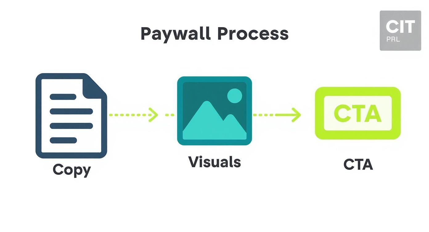
This process really drives home how copy, visuals, and the call-to-action must work together to convince a user to convert, giving you a clear framework for your experiments.
Key Takeaway: You aren't just testing prices; you're testing how you communicate value. A test that shows a lower price converts better might actually be telling you that your paywall isn't doing a good enough job justifying the higher price.
Measuring Success and Avoiding Common Pitfalls
Once your test is live, it’s time to be patient. You have to let it run long enough to achieve statistical significance—a mathematical way of saying you're confident the results aren't just random chance. Most A/B testing tools calculate this for you, but as a rule of thumb, aim for at least a 95% confidence level before declaring a winner.
Whatever you do, don't end a test early just because one variant pulls ahead after a day or two. Daily fluctuations are completely normal, and making a premature call can easily lead you down the wrong path.
Here are a few common mistakes I see teams make all the time:
- Testing Too Much at Once: As I mentioned, this makes it impossible to know what really moved the needle. One change, one test.
- Ignoring Segmentation: A price change might hurt conversions with new users but be a huge win with returning ones. Always analyze results across different user segments.
- Calling It Quits Too Soon: You need to let the data mature. A test requires enough time and traffic to produce results you can actually trust.
By taking a structured approach, you can turn your pricing and packaging strategy into an engine for continuous improvement, systematically finding that sweet spot that maximizes both user value and your revenue.
Analyzing Performance to Drive Long-Term Growth

A great pricing strategy isn't something you set and forget. It breathes and evolves right alongside your app and your audience. Think of your launch day as the starting line, not the finish. From here on out, it’s a continuous loop of analyzing, learning, and iterating.
To build a model that actually drives sustainable growth, you have to treat your pricing and packaging as a core feature of your product—one that’s constantly being shaped by real user data.
This whole process kicks off with zeroing in on the key performance indicators (KPIs) that genuinely reflect your app's financial health. It’s incredibly easy to get lost in a sea of data. The real skill is focusing on the few metrics that tell a clear story about how users see your app's value. These are the numbers you need to know inside and out.
Identifying Your Core Monetization KPIs
For a full picture, you need to track metrics across the entire user journey—from the moment they first see your paywall to their long-term value as a loyal subscriber. While there are countless things you could track, a few are absolutely non-negotiable for any subscription app.
- Conversion Rate: What percentage of users subscribe after seeing your paywall? This is your clearest signal of how well your value proposition is landing.
- Average Revenue Per User (ARPU): Your total revenue divided by your active users. ARPU gives you a quick snapshot of what a typical user is worth.
- Customer Lifetime Value (LTV): The total revenue you can realistically expect from a single customer over their entire time with your app. This is the north star metric for a healthy business.
- Churn Rate: The percentage of subscribers who cancel their plan in a given period. High churn can quietly sabotage your growth, even if you’re bringing in tons of new users.
Nailing these core figures is just the beginning. For a deeper dive, you can learn more about the most important metrics for apps in our detailed guide. What really matters is understanding how these numbers influence each other. A killer conversion rate feels great, but if your LTV is low, it might be a red flag that your price is too low to sustain the business long-term.
When to Make Big Changes Versus Small Tweaks
Your data is going to point out areas for improvement—that's a guarantee. The trick is knowing when a small, surgical tweak is needed versus a major overhaul. Getting this wrong can kill your momentum or, worse, alienate your user base.
Small tweaks are your bread and butter for ongoing optimization. These are low-risk adjustments you can constantly A/B test to sharpen your approach.
- Changing the text on a call-to-action button.
- Swapping out the hero image on your paywall.
- Nudging the annual plan discount from 20% to 25%.
- Switching which tier gets the "Most Popular" badge.
Big changes, on the other hand, are major strategic shifts. You should make these much less often and with a whole lot more planning. These are best saved for pivotal moments in your app’s journey.
- Introducing an entirely new pricing tier.
- Pivoting from a freemium model to a free trial.
- A significant price increase across the board.
- Fundamentally rethinking which features belong in each package.
A big overhaul typically makes sense after a major feature release that brings a ton of new value to the table, or if the market itself has changed dramatically. Otherwise, stick to incremental gains.
Key Takeaway: Treat your pricing like a product. Small, iterative updates are often more effective than infrequent, disruptive overhauls. Consistent, data-informed tweaking leads to sustained growth.
Handling Price Adjustments for Existing Customers
This is one of the most delicate balancing acts you'll face: changing prices for people who are already paying you. If you mess this up, you risk a PR nightmare and a wave of cancellations. But if you handle it with care, you can make a smooth transition and even strengthen user loyalty.
The gold standard here is to grandfather your existing users. Let them keep their original price, forever. This simple act generates incredible goodwill and rewards the people who believed in you from the start. Yes, you might be leaving some money on the table in the short term, but the loyalty you build is often worth far more.
If you absolutely must raise prices for everyone, communication is everything.
- Give plenty of notice. Tell users at least 30-60 days ahead of time. No one likes a surprise on their credit card statement.
- Explain the "why." Be transparent about the reason for the change. Frame it as an investment in making the app better for them, and point to specific new features or improvements that justify the new price.
- Acknowledge their loyalty. Thank them for being a customer. A small gesture, like a one-time discount on the new price, can go a long way.
By constantly analyzing your numbers, making thoughtful adjustments, and always treating your customers with respect, you can build a pricing strategy that doesn’t just capture value today—it fuels your app's growth for years to come.
Common Pricing and Packaging Questions
Figuring out the nitty-gritty of mobile app pricing is where a lot of developers get stuck. You can have a brilliant strategy, but when it comes to the day-to-day decisions of what to test, when to change prices, and how to structure your offers, things get complicated fast. Let's tackle some of the most common questions that come up.
These aren't just theoretical answers; they're based on what works (and what doesn't) out in the real world.
How Often Should I Test My App Pricing?
There's no magic schedule, but a good rhythm is to do a major review of your entire pricing structure about once a year or after a massive feature drop. This is your moment to step back and ask if your tiers still make sense and reflect the value you're providing.
But don't wait a whole year to test your paywall. You should be running smaller A/B tests on things like copy, layout, and calls-to-action much more often—maybe even quarterly. The trick is to go into each test with a specific question. For example, your hypothesis could be: "We believe that visually emphasizing the annual plan's savings will boost its adoption by 15%." Just make sure you let any test run long enough to get clean, statistically significant results before calling a winner.
How Should I Handle Pricing Changes for Existing Subscribers?
Tread very carefully here. This is all about balancing fairness with your business goals. The absolute best practice is to "grandfather" your existing subscribers, letting them keep their original price for as long as they stay subscribed. It's a simple act that builds a ton of goodwill and shows your earliest supporters you value them.
If you absolutely have to raise prices for everyone, communication is everything.
- Give plenty of warning: Let people know at least 30-60 days before the new price kicks in.
- Explain the "why": Don't just announce a hike. Frame it as an investment back into the app they love, maybe by pointing to new features you've added or are building.
- Say thank you: Acknowledge their loyalty. It goes a long way.
Jamming a price increase down your users' throats without a good reason is a surefire way to burn the trust you've worked so hard to build.
A Note From Experience: Treat your early adopters like gold. Grandfathering their price creates long-term loyalty that is almost always more valuable than the short-term revenue bump you'd get from a price hike.
Should I Offer Monthly or Annual Subscription Plans?
Honestly, you should offer both. They serve two very different but equally important purposes. A monthly plan is a low-commitment entry point. It makes it easy for a new user to say "yes" without a lot of friction and gets them into your product.
The annual plan, however, is your cash flow and LTV powerhouse. To make it a no-brainer, you need to offer a steep discount—think 15-30% off the total monthly price. On your paywall, make this plan the hero. Slap a "Best Value" or "Most Popular" badge on it and spell out the savings in dollars and cents, like "Save $48 per year."
How Many Pricing Tiers Should My App Have?
For most mobile apps, three is the magic number. If you only offer one option, you're leaving money on the table because you aren't catering to different types of users. On the flip side, if you offer four or more choices, you risk causing decision paralysis—overwhelming users to the point where they just give up and leave.
A classic three-tier structure (think "Good," "Better," "Best") lets you tap into powerful psychological effects like anchoring and the "center stage effect," which naturally nudges people toward your preferred middle tier. It’s a clean way to segment your audience and give them a clear path to upgrade as they get more value from your app.
Ready to stop guessing and start optimizing? Nuxie gives you an AI-powered paywall studio to design, target, and ship high-converting offers in minutes, without waiting for app store approval. Integrate in five minutes and see what data-driven paywalls can do for your revenue. Learn more and get started for free at https://nuxie.io.