Launch a Winning Free Trial of Products for Apps
A complete guide to designing and launching a free trial of products for mobile apps. Learn how to increase conversions and grow your subscriber base.
A great free trial isn't just a giveaway. It's a meticulously crafted experience designed to prove your app's value and gently guide users toward a paid subscription. The real goal is to get them to that "aha!" moment, where upgrading feels less like a purchase and more like a natural next step.
Architecting a High-Conversion Free Trial
The foundation of a killer free trial isn't the code or the paywall—it's the strategy behind it. Before you even think about implementation, you have to decide what "success" actually means for you.
Are you playing the volume game, trying to get as many people as possible in the door to build a massive user base? Or are you focused on maximizing revenue, targeting only the most serious potential subscribers? Your answer here will dictate every other decision you make.
This initial planning phase is all about mapping the ideal user journey. Think about it from their perspective: from the second they see your trial offer to the moment they decide to pull out their wallet. It boils down to defining your goals, figuring out how a user finds value in your app, and then picking the right trial model to make it happen.
This flowchart lays out the core strategic steps pretty well. It's all about a deliberate, user-centric approach.
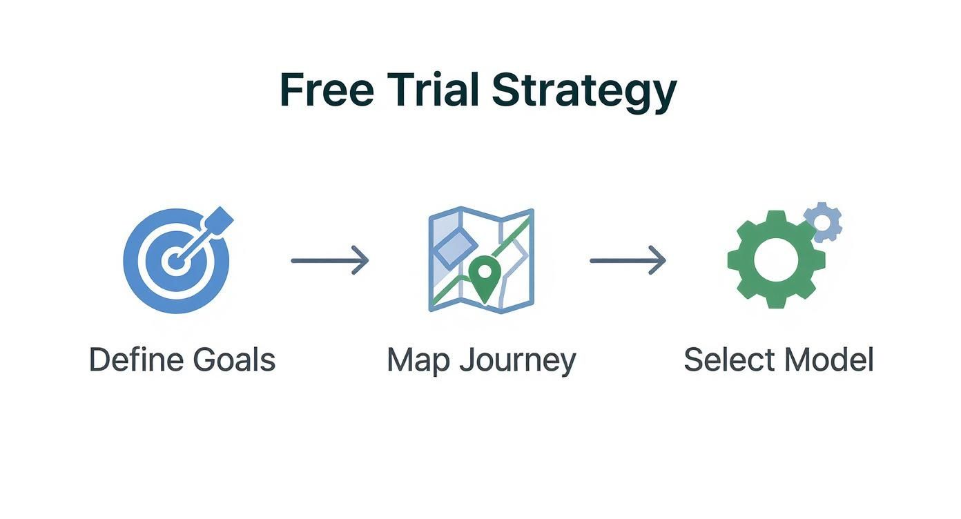
A successful trial is never an accident. It's the result of smart, intentional planning.
Defining Your Primary Trial Objective
Every choice you make—from the length of the trial to which features you unlock—has to tie back to your main goal. You really need to pick one primary objective to act as your North Star.
Most apps fall into one of these buckets:
- Maximizing Conversion Rate: This is all about turning the highest percentage of trial users into paying customers. It usually means creating a super smooth, high-value experience that makes the premium benefits impossible to ignore.
- Accelerating User Acquisition: Here, it’s a numbers game. The goal is to lower the barrier to entry as much as possible, encouraging a flood of downloads and trial starts to quickly build a user base.
- Driving Engagement and Habit Formation: For some apps, the trial is about getting users hooked. You want them to integrate a core feature into their daily routine so the app becomes indispensable. Success isn't just about the final conversion; it's measured by things like daily active use.
Picking a single goal brings a ton of clarity. For example, a meditation app might prioritize habit formation, offering a 14-day trial to encourage a daily practice. On the other hand, a powerful photo editor might go for maximum conversion with a punchy, feature-packed 3-day trial.
Choosing Your Trial Model
Now for the big one: do you ask for a credit card upfront? This is probably the most critical decision you'll make, and it creates two very different user experiences: the opt-in trial and the opt-out trial.
An opt-in trial (no credit card needed) is all about reducing friction. You'll get way more sign-ups, but the conversion rate to paid is typically lower. An opt-out trial (credit card required) adds that friction back in. You'll get fewer people starting the trial, but they are far more qualified and much more likely to convert.
An opt-out model essentially asks the user to make the purchase decision upfront, trusting that they will cancel if they don't find value. This pre-qualification is why it yields higher conversion rates.
The table below breaks down the key differences, helping you weigh the pros and cons of each approach.
Comparing Opt-In vs Opt-Out Free Trial Models
| Attribute | Opt-In (No Credit Card) | Opt-Out (Credit Card Required) |
|---|---|---|
| User Friction | Low. Easy for anyone to start a trial. | High. Users must commit with payment details. |
| Trial Volume | High. Attracts a large number of users. | Low. Filters out less serious or casual users. |
| Lead Quality | Lower. Attracts a mix of serious and casual users. | Higher. Users are pre-qualified and have purchase intent. |
| Typical Conversion Rate | 18% - 25% | 49% - 60% |
| Best For | Maximizing user acquisition, building a large top-of-funnel, and gathering broad feedback. | Maximizing revenue, targeting high-intent users, and achieving a higher trial-to-paid conversion rate. |
The industry data really drives this point home. While you can find more detailed free trial conversion statistics, the general trend is clear. Opt-in trials tend to hover in the 18-25% conversion range, whereas opt-out trials that demand a credit card can see conversion rates soar to 49-60%.
Ultimately, the model you choose should be a direct reflection of that primary objective you set earlier. Are you hunting for volume or for high-quality conversions? The answer will point you in the right direction.
Alright, you’ve got your strategy nailed down. Now for the fun part: actually building the thing. This is where we move from whiteboards and spreadsheets to the nitty-gritty of Apple's and Google's ecosystems. Bringing your free trial to life means getting your hands dirty with StoreKit and Google Play Billing.
The whole process boils down to two main stages. First, you have to configure your trial offers inside App Store Connect and the Google Play Console. Second, you need to use their billing libraries to actually show those offers to your users and handle the transaction. While the platforms have a lot in common, each has its own quirks you'll need to get familiar with.
Getting Set Up in the App Store and Google Play
Think of Apple's StoreKit and Google Play Billing as the gatekeepers for all your in-app purchases. They’re the APIs your app has to use to talk to the stores, pull product info, process payments, and figure out who has an active subscription.
If you're on iOS, you’ll be working in StoreKit. For Android, it's the Google Play Billing Library. The first step is to create an "introductory offer" for your subscription product within each platform's dashboard.
You'll need to define a few key things:
- Trial Period: Is it 7 days? 14? Maybe a full month? You set the duration here.
- Eligibility: The stores handle this automatically, which is nice. They typically limit a free trial to one per user for a specific subscription, so people can't just keep signing up for free.
- Pricing: You have to set the standard price that kicks in the moment the trial ends.
I can't stress this enough: get these settings right before you write a single line of code. So many bugs and angry user emails stem from a simple misconfiguration in one of these dashboards.
The Great Debate: Native SDKs vs. Third-Party Platforms
When it's time to code, you’ve got a major decision to make. Do you go native and use the platform SDKs directly, or do you bring in a third-party service like RevenueCat? Each path has some serious trade-offs that will affect how fast you can move, how flexible you are down the road, and what kind of data you can see.
Going native means building directly against StoreKit 2 on iOS and the Google Play Billing Library on Android. This gives you ultimate control and keeps your app dependency-free. The massive downside? Your team is now on the hook for building and maintaining all the server-side logic to validate receipts and manage subscription states. That is a huge job, especially when you have to keep it working across both platforms.
Just take a look at Apple's own documentation for StoreKit. It gives you a sense of all the moving parts you'd be responsible for managing.
That diagram alone shows you how complicated it can get trying to manage everything yourself.
This is why many teams opt for a third-party platform like RevenueCat. These services wrap both StoreKit and Google Play Billing into a single, unified SDK. You get one API to work with, and they handle all the messy backend stuff like receipt validation and cross-platform entitlements. We're talking about saving hundreds of development hours.
The real magic of a service like RevenueCat is that it becomes the single source of truth for your customer's subscription status. This makes everything—from unlocking premium features to analyzing churn across both iOS and Android—infinitely simpler.
Let's break it down head-to-head.
| Aspect | Native (StoreKit 2 / Google Play Billing) | Third-Party (e.g., RevenueCat) |
|---|---|---|
| Development Speed | Slower. You have to build a ton of backend infrastructure for receipt validation and state management. | Way faster. They handle the backend, so you can get your trial live in a fraction of the time. |
| Flexibility | High. You own the whole stack and can build any custom logic you can dream up. | Moderate. You're working within their feature set, which might be a bit restrictive for really specific edge cases. |
| Maintenance | High. Your team has to maintain servers and constantly stay on top of API changes from Apple and Google. | Low. The platform takes care of all backend maintenance and API updates for you. |
| Analytics | Basic. You have to build your own analytics pipeline from scratch to track subscription metrics. | Advanced. You get out-of-the-box dashboards for MRR, churn, conversion rates, and more. |
Honestly, for most teams—especially smaller ones or those just trying to ship fast and learn—using a third-party platform is a no-brainer. The speed and reliability you gain almost always outweigh the desire for 100% control. As we explore in our guide on the essentials of a successful product free trial, having a solid technical foundation is what allows you to test and optimize effectively later on. It's a make-or-break piece of the puzzle.
Designing Paywalls That Actually Convert Users
Your paywall is more than just a payment screen. Think of it as the final handshake before a user commits to your free trial of products—it's the critical moment where your value proposition, user trust, and thoughtful design have to come together perfectly.
I've seen so many developers treat the paywall as an afterthought, and it's a huge mistake. A clunky, unconvincing paywall will stop even the most interested user dead in their tracks. On the flip side, a great one makes starting a trial feel like an obvious, even exciting, next step.
When it comes to your app's revenue, this is arguably the most important screen you'll design. Its sole job is to clearly and persuasively articulate the value a user is about to unlock. This means you have to move beyond generic templates and think about how the paywall fits into the user's journey, showing up at just the right time with a message that clicks.
Crafting a Compelling Value Proposition
Your paywall needs to answer one question instantly and without any ambiguity: "What's in it for me?"
Honestly, users don't care about your long list of features. They care about what those features will do for them. Your copy has to be all about the benefits, not just the functions.
For example, instead of saying "Access our advanced filters," try something like, "Create stunning photos that stand out." The second one speaks directly to the user's desire. I always recommend using clean, simple bullet points to highlight the top 3-4 benefits they'll get by starting a trial.
Here are a few angles I've seen work really well:
- Problem-Solution: Gently remind them of the pain point that brought them to your app in the first place, then position your premium version as the ultimate solution.
- Aspirational: Paint a picture of a better version of themselves—more productive, more creative, healthier—and show them how your app is the tool to get them there.
- Exclusivity: Frame your premium features as an exclusive club or a set of professional-grade tools that they're about to gain access to.
The language you choose is everything. Keep it simple, powerful, and always focused on the user's end goal.
The most successful paywalls don't sell a subscription; they sell an outcome. By the time a user sees the screen, they should already understand the core value, and the paywall simply seals the deal by summarizing the benefits and making the next step frictionless.
Leveraging Social Proof and Urgency
People are wired to follow the crowd. We're heavily influenced by what others are doing, which is why integrating social proof into your paywall can be a game-changer for building trust and lowering the risk a user feels.
Even a simple line like, "Join 50,000+ happy subscribers," can be incredibly persuasive.
Here are a few other types of social proof that work wonders on paywalls:
- Testimonials: A short, punchy quote from a real user can add a ton of credibility.
- Star Ratings: If you have a great App Store rating, show it off!
- "Featured In" Logos: Showcasing logos of well-known publications that have covered your app builds instant authority.
This isn't about bragging; it's about reassuring the user that they're making a good choice that's already been validated by others like them.
Paywall Placement and Remote Configuration
Where and when you show the paywall is just as important as what's on it.
If you throw it up too early, it feels aggressive and can scare people away. But if you wait too long, you might miss that peak moment of motivation.
A winning strategy is to let users have a core "aha!" moment first. Let them experience a key benefit of your app, and then present the paywall when they try to access a premium feature. We call this a contextual paywall, and it converts exceptionally well because the value you're offering is immediately obvious and relevant to what they're trying to do.
Now, to really dial this in, you need to be able to test and iterate without shipping a new app update every week. This is where remote configuration tools are indispensable. By managing your paywall's content, layout, and logic from a server, you can A/B test everything—headlines, benefit lists, button colors, and even pricing.
This flexibility is what separates the good paywalls from the great ones. For a deeper look at getting your app live with these kinds of dynamic elements, check out our detailed guide on launching the app successfully. The ability to experiment on the fly is your secret weapon.
How to Measure and Optimize Trial Performance
Getting your free trial live is a huge step, but the real work is just beginning. Now, it's all about turning that initial interest into a reliable engine for growth. Success from here on out isn't about guesswork; it’s about systematically measuring what works, understanding how people actually use your app, and tweaking every part of the funnel.
This is where great apps pull away from the pack. It’s not enough to get users in the door; you have to know precisely why they stick around or why they bail. By keeping a close eye on a few crucial metrics, you can transform your trial from a simple feature into your most powerful conversion tool.
Defining Your Core Trial Metrics
You could track dozens of data points, but I've found it’s best to laser-focus on the three pillars of trial performance first. These key performance indicators (KPIs) give you a clean, high-level snapshot of your funnel's health. You'll want to get a solid grip on these before digging into more granular analysis.
These are the non-negotiables:
Trial Start Rate: This is your top-of-funnel pulse check. It's the percentage of people who see your paywall or trial offer and actually tap the button to start. A low number here often points to problems with your value proposition, the design of your paywall, or how you're presenting the price.
Trial-to-Paid Conversion Rate: This is the big one. What percentage of users who finish their free trial of products become paying subscribers? This metric is the ultimate report card on how well your app delivered on its promises during the trial.
Post-Trial Churn: This tracks how many new subscribers cancel shortly after their first payment hits, usually within the first month. A high post-trial churn is a major red flag. It could mean users aren't finding long-term value, or maybe they just forgot to cancel.
By constantly monitoring these three figures, you create a powerful diagnostic tool for yourself. A sudden drop in your start rate tells you to go look at your paywall. A dip in the conversion rate? Time to investigate the in-app experience itself. For a complete overview, you can explore more essential metrics for apps in our detailed guide.
Building Your Analytics Pipeline
To track these numbers accurately, you need a reliable analytics pipeline. You've got two main paths: using the native tools from Apple and Google or integrating a dedicated subscription management platform.
Native store analytics are a decent starting point, but they often give you delayed or aggregated data. This makes it tough to follow individual user journeys and figure out why things are happening. It's why so many developers I know use a platform like RevenueCat. It acts as a single source of truth for your subscription data across both iOS and Android, giving you real-time insights and making it way easier to segment users and track conversion events.
Your analytics setup is the foundation for everything else. Without clean, reliable data, you're just flying blind. Seriously, invest the time to get this right. It will pay dividends in every A/B test you run down the line.
The broader digital world backs this up. The global ecommerce sector is valued at around $6.9 trillion, and for those shoppers, incentives are everything. A whopping 52.6% of consumers say free shipping is the top reason they complete a purchase. While a mobile app isn't a physical product, the user psychology is the same: the experience needs to feel frictionless and valuable. You can read more about the intersection of free offers and online consumer behavior to get a better sense of this.
Running Effective A/B Tests
Once your metrics and pipeline are in place, you can finally start optimizing through A/B testing. This is just a structured way of showing different versions of your trial experience to different groups of users to see which one performs better.
The goal is to isolate one variable at a time and measure its direct impact on your core KPIs.
Here are a few high-impact elements I always recommend testing:
- Trial Length: Does a snappy 3-day trial create more urgency and convert better than a 7-day one? Or does a 14-day trial give users more time to build a real habit with your app? Test it.
- Paywall Copy and Design: Try out different headlines, benefit bullet points, and call-to-action text ("Start Your Free Trial" vs. "Unlock All Features"). Even changing the imagery can have a surprising impact.
- Onboarding Messages: Experiment with different in-app messages or push notifications during the trial. For example, send one group a notification highlighting a key feature on day two and see if it moves the needle on engagement and conversion.
By running these controlled experiments, you shift from making assumptions to making data-driven decisions. Every test—win or lose—gives you a valuable piece of the puzzle about what motivates your users, helping you systematically make your trial better and better over time.
Automating Retention and Reducing Churn
You’ve done all the hard work to get a user to start a trial and convert to a paid subscriber. The last thing you want is for them to churn out a month later. After all, it costs way more to get a new customer than to keep one you already have. The key is to get ahead of churn with smart, automated systems that keep subscribers engaged and catch them before they even think about leaving.

Great retention isn't about some grand, last-ditch effort. It's built on a series of small, timely interactions that happen automatically. These campaigns work behind the scenes to reinforce your app's value, handle common billing hiccups, and make your subscribers feel appreciated long after their first payment.
Building Proactive Churn-Save Campaigns
The best way to reduce churn is to stop it before it starts. This means figuring out who’s at risk and reaching out with the right message at just the right moment. An automated churn-save campaign can be your 24/7 retention specialist.
Let’s look at the user journey. One of the most critical points is right before their trial ends and the first charge hits. You can build a campaign that automatically sends a push notification 24 hours before that happens.
This little nudge could:
- Highlight a key premium feature they’ve been using, reminding them what they'll lose.
- Offer a one-time discount on their first year to seal the deal.
- Simply remind them of the upcoming charge, which builds trust and prevents surprises.
These automated triggers are so effective because they’re contextual. They address potential objections or simple forgetfulness right when it matters most.
Preventing Involuntary Churn from Billing Issues
A shocking amount of churn happens by accident. Involuntary churn is when a customer's payment fails because of an expired card, not enough funds, or a bank decline. The user actually wanted to stay, but a technical glitch got in the way.
This is where grace periods and dunning campaigns are a lifesaver. Both Apple’s StoreKit and the Google Play Billing Library have built-in support for billing retries and grace periods, so be sure to use them.
A grace period gives a subscriber a few extra days of premium access after a payment fails. This provides a window to update their payment details without any interruption to their service, which is a far better user experience than immediately locking them out.
You can layer on your own automated email or in-app message campaigns. When a payment fails, trigger a message that takes the user directly to their subscription settings to update their card info. This simple, automated flow can recover a massive amount of revenue you would have otherwise lost.
The Power of Post-Conversion Engagement
Once a user converts, the job isn’t done. That first month is absolutely critical for cementing their decision and turning them into a long-term, loyal fan. Your goal is to keep showing them the value they’re paying for and make them feel like a core part of your community.
Consider creating an automated onboarding flow just for new subscribers. This could be a series of emails or in-app messages spread out over their first few weeks.
Here’s what that might look like:
- Week 1: A "welcome" message that thanks them for subscribing and shares a pro-tip for a feature they've already used.
- Week 2: A notification about a new feature or piece of content they now have access to.
- Week 4: A short survey asking for feedback on their experience so far.
This continued engagement fights off buyer's remorse and proves that the value didn't stop once their payment went through. For example, research shows that around 40% of subscription cancellations are tied to losing perks. While you might not be shipping a physical product, this shows just how vital ongoing value is. Things like loyalty rewards or even flexible options like pausing a subscription can play a huge role. You can find more data on how subscription perks impact customer retention on sticky.io.
By automating these small, value-add touchpoints, you build a much stronger and more resilient subscriber base.
Answering the Big Questions About Free Trials

When you're planning a free trial of products, a handful of questions pop up every single time. Nail these foundational decisions, and you're setting yourself up for success. Get them wrong, and you could be kneecapping everything from your user acquisition to your final conversion rate.
Let's dig into the most common questions I hear from developers and product managers.
How Long Should My Free Trial Be?
Honestly, there’s no single "right" answer. The ideal length for your trial comes down to one thing: your product's "time-to-value." How long does it take for someone to have that 'aha!' moment—where they get what your app does for them and can't imagine living without it?
A simple utility app, maybe a photo editor with cool filters, could get away with a punchy 3-day trial. The value is instant. But for a productivity app or a fitness tracker, you need to give people more runway. They need to weave it into their daily lives, which is why a 7 or 14-day trial often works better.
The goal isn't just to give away free time. It's to provide just enough time for a user to experience a core benefit they can't imagine losing. That's what gets them to pull out their wallet.
The only way to know for sure is to test it. Pit a 7-day trial against a 14-day one. Your conversion data will give you a clear winner for your specific audience.
Should I Ask for a Credit Card Upfront?
This is the age-old debate: quantity vs. quality. Your answer here will have a massive impact on the shape of your entire funnel.
No Credit Card (Opt-In): This is the path of least resistance. You'll see a flood of new trial sign-ups because there's virtually no barrier to entry. The catch? The conversion rate to a paid plan will be lower, since many of these users are just kicking the tires.
Credit Card Required (Opt-Out): Asking for payment info upfront is a major friction point. Fewer people will start a trial, no doubt. But the ones who do are serious. They have a high intent to buy, which means your trial-to-paid conversion rate will be significantly stronger.
So, what's the right move? If your main goal is getting as many people in the door as possible, and you're confident your onboarding is world-class, the opt-in model can work. But if you’re focused on maximizing revenue from high-intent users, requiring a card upfront is almost always the better bet.
How Do I Stop People From Abusing the Trial?
It’s a classic problem: the user who keeps finding ways to get another free trial to avoid paying. It’s frustrating, but you absolutely can get a handle on it with a few smart moves.
First, don't tie trial eligibility to something flimsy like a device ID. That’s just asking for trouble. Instead, link the trial to a verified user account—their Apple ID, Google Account, or your own login system. This makes it much harder for someone to just delete and reinstall the app to start over.
Tools like RevenueCat are also fantastic for this. They're built to manage subscription eligibility across platforms, ensuring one user gets one trial, period. And finally, cover your bases legally. Your terms of service should state loud and clear that the free trial of products is limited to one per person. It gives you a clear policy to fall back on.
At Nuxie, we make it easy to design, target, and launch high-converting paywalls without waiting for an app update. Integrate our SDK in minutes and start optimizing your trial-to-paid conversions today. Get started for free at nuxie.io.