Master Your Onboarding Quiz App: Design & Boost Retention
Build a high-impact onboarding quiz app. Design, implement (iOS/Android/Unity), analyze, and test for user personalization and retention.
Teams usually decide to build an onboarding quiz app in the same meeting where they worry it will hurt conversion.
Product wants personalization. Growth wants better trial starts. Design wants a smoother first session. Engineering sees branching logic, remote config, analytics debt, localization edge cases, and one more flow that can break across iOS, Android, React Native, Flutter, Unity, and Unreal. Everyone is right.
A bad quiz feels like paperwork before value. A good one feels like progress. The difference isn't visual polish alone. It's whether the quiz changes what happens next. If every user gets the same screens, the same paywall, the same reminders, and the same empty “thanks” state after answering five questions, you didn't build onboarding. You built delay.
The strongest onboarding quizzes work as routing systems. They identify intent, capture just enough context, and move the user into a more relevant journey. That might mean a personalized plan, a feature path, a content feed, reminder setup, a segmented offer, or a paywall variant that matches the user's stated goal. In practice, the quiz is just the first node in a connected experience.
Why Most Onboarding Quizzes Fail
Most failed quizzes share the same pattern. The team starts with questions instead of decisions.
Someone pulls examples from a meditation app, a fitness app, and a language app. The list grows fast. “What's your goal?” becomes seven questions. “How often do you want reminders?” turns into a preference center. Then the flow ships with attractive cards, haptics, and animations, but no meaningful downstream change.
Users notice that immediately.
The quiz asks a lot and changes little
The failure mode isn't usually that the questions are ugly. It's that the exchange is unfair. Users spend time answering, but the app doesn't earn that effort back with better guidance, faster setup, or a more relevant next screen.
A quiz should buy relevance. If it only collects data, users feel the cost and miss the benefit.
Many subscription and game teams get stuck, assuming more inputs create more personalization. In reality, more questions often create more abandonment, more analytics complexity, and more app code paths that no one wants to maintain.
Teams treat the quiz like a self-contained feature
Another common mistake is architectural. The quiz gets implemented as a one-off onboarding component with its own local state and event names, while paywalls, entitlements, experiments, feature flags, and lifecycle messaging live somewhere else. That split makes optimization slow.
A product team can't easily answer basic questions:
- Did branch selection improve activation? Or did it only move drop-off later?
- Did the paywall perform better because of quiz segmentation? Or because one cohort already had higher intent?
- Did reminder preferences help retention? Or were they never applied downstream?
Hard-coded flows are especially brittle in mobile apps and games. A small copy edit may need a release. A branch change can touch app logic. Cross-platform parity breaks. Analytics schemas drift.
Good quizzes are narrow and connected
The quiz works when it behaves less like a survey and more like a decision engine. It should help the app decide what the user sees next, what gets skipped, what gets emphasized, and what gets measured.
That's the practical lens to use for the rest of the build.
Start with the Outcome Not the Questions
The right first question for an onboarding quiz app isn't “What should we ask?” It's “What should happen after this flow if it works?”
If you can't answer that in one sentence, the quiz is still too vague to build.
A useful template is simple: identify the user's goal, capture one or two constraints, show a personalized recommendation, then route to the right next step. That structure keeps the quiz tied to product outcomes instead of turning it into a generic intake form.
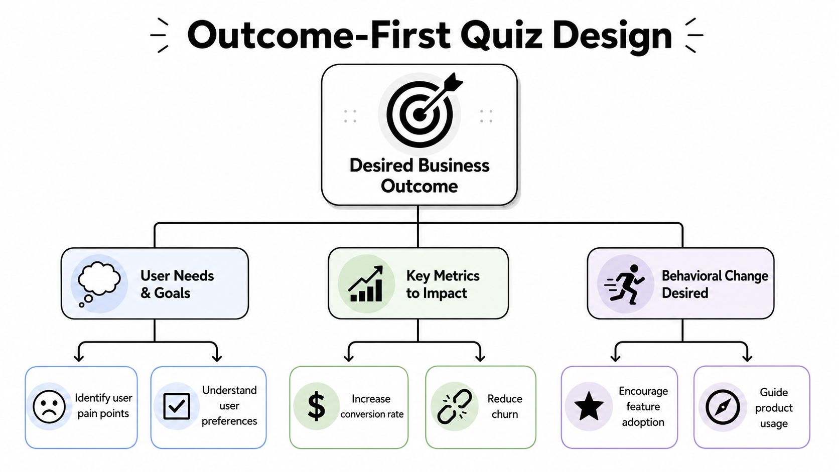
Define the post-quiz action
Strong onboarding flows end in a concrete action. For a subscription app, that might be a personalized plan plus trial prompt. For a game, it might be recommended mode selection, starter pack framing, or tutorial branch selection. For a utility app, it may be permission setup and the first successful task.
Customer onboarding data supports taking this early experience seriously. Akita's 2024 compilation reports that apps with a good onboarding experience have a 50% higher retention rate and that 63% of customers consider onboarding when deciding to subscribe, according to Akita's customer onboarding statistics.
Those numbers don't mean every app needs a quiz. They do mean the first-run experience needs a job.
Work backward from business logic
A practical way to scope the flow is to write the routing logic before writing final copy. Start with statements like these:
- If the user's goal is habit-building, send them to reminder setup and streak framing.
- If the user wants faster results, prioritize the shortest path to first value.
- If the user already has an active entitlement, skip monetization screens and continue setup.
- If the user signals low confidence, reduce feature exposure and increase guidance.
This prevents a common problem: asking questions whose answers nobody uses.
Four inputs are usually enough
Many teams can get useful personalization from four elements:
Primary goal
What outcome does the user want right now?Constraint or blocker
What makes success harder? Time, experience, confidence, equipment, budget, content preference.Delivery preference
How should the app support them? Reminders, recommendations, pacing, content type.Next-step eligibility
Is the user signed in, entitled, permission-ready, or appropriate for a specific branch?
Practical rule: if a question doesn't change the recommendation, branch, message, or experiment, cut it.
Design for decisions, not profiles
Teams often over-index on profile completeness. They want to know everything up front. That's rarely necessary in the first session. The better move is to collect the minimum data needed to improve the immediate next step.
That discipline also helps engineering. Less data means simpler event schemas, fewer edge cases in state handling, smaller localization scope, and a cleaner experimentation plan. It gives growth a tighter testing surface and gives design a better chance to keep the flow feeling fast.
An onboarding quiz app performs best when every answer has an operational use. Not “nice to have later.” Used now.
Designing a Quiz That Engages and Personalizes
Good onboarding quiz UX feels light because it reduces uncertainty at every step. Users know why they're answering, how long it will take, and what they'll get in return.
That's especially important when the quiz asks anything personal. The wording matters, but the setup matters just as much. Users are more willing to answer when the app explains why the information is needed and pays it off quickly with a better recommendation.
Keep the flow brief and visible
A practical pattern is to use one decision per screen, a visible progress indicator, and short contextual support text under the main question. Guidance from RevenueCat's analysis of onboarding length and UX trade-offs recommends keeping onboarding brief, optional, and context-rich, explaining why each question is asked, showing a progress bar, and limiting feedback surveys to 2–3 questions maximum.
That advice aligns with what works in production. Single-focus screens reduce scanning load. Progress bars reduce perceived effort. “Why we're asking” copy lowers resistance, especially for health, finance, and identity-adjacent questions.
A sequence that usually works
One reliable sequence for a subscription product is a goal-setting flow:
Start with intent
Ask what the user wants to achieve.Ask what they've already tried
This avoids generic recommendations and helps tune messaging.Surface the blocker
Lack of time, consistency, knowledge, confidence, or something else.Set delivery preferences
Reminders, recommendations, pace, or content format.
Then convert those answers into an immediate plan. Don't end with “You're all set.” End with a personalized screen that reflects the user's own inputs and points to a specific next action.
Ask sensitive questions with context
The emotional cost of a question often matters more than the word count. If you ask about weight, stress, spending, motivation, or personal struggle too early, users may interpret the flow as extractive. If you ask after establishing relevance and giving reassurance, response quality usually improves.
A few working patterns:
Explain the purpose before the ask
“We use this to tailor your first plan” is better than a cold prompt.Reduce pressure at the first step
Start with broad intent before moving into more personal detail.Add reassurance after a vulnerable answer
A short acknowledgment can keep momentum.
For teams building audience segments, behavioral segmentation in mobile apps becomes more useful than static demographics. Segment users by desired outcome and in-product behavior, not just by who they are.
Don't confuse delight with speed bumps
Animations, transitions, and micro-interactions help when they clarify state changes or reward progress. They hurt when they delay repeated actions or make the user wait between answers. This is common in highly designed quiz funnels that optimize for “premium feel” at the cost of completion.
Use polish where it helps:
| Pattern | Works when | Fails when |
|---|---|---|
| Progress animation | Confirms movement through the flow | Adds delay after every answer |
| Card selection | Makes options easier to scan | Turns simple lists into large swipes |
| Inline illustration | Reinforces recommendation or context | Pushes the answer options below the fold |
The quiz should feel conversational, not theatrical.
Implementing Your Quiz Across Mobile Platforms
The technical mistake I see most often is branching logic scattered across app code, analytics wrappers, paywall conditions, and backend flags. That setup works for one release. It becomes painful by the third experiment.
A better pattern is to treat the quiz as a remotely managed flow with explicit state, shared event names, and branch rules that product, design, and engineering can inspect together.
Hard-coded versus flow-managed logic
Here's the trade-off many teams are deciding between.
| Approach | Logic Management | Update Speed | Best For |
|---|---|---|---|
| Native hard-coded flow | In app code across screens and services | Requires release cycle | Very stable, simple onboarding with minimal branching |
| Remote config plus app screens | Logic split between code and config | Faster copy and flag updates | Teams with moderate experimentation needs |
| Visual flow-managed system | Logic, branching, and screen sequencing managed in one place | Fastest for iteration without app releases | Apps and games running active personalization and experiments |
If you want to compare what a flow-managed setup looks like in practice, this walkthrough of an in-app flow builder for mobile journeys is the right mental model.
Model the quiz as state, not screens
On iOS with SwiftUI or UIKit, Android with Compose or XML, React Native, Flutter, Unity, or Unreal, the implementation principle is the same. Separate rendering, state, and decision logic.
The minimum state model usually includes:
- Current node or screen ID
- Answer map by question key
- Derived branch assignment
- Eligibility state, such as signed-in or entitled
- Completion markers
- Resume token or local persistence state
Once you do that, each client can render the same flow definition in platform-appropriate UI while preserving the same logic.
Put branch rules in one inspectable layer
A clean rule set looks like this in concept:
- If
goal = lose_weight, show a progress-plan recommendation. - If
goal = build_habit, show reminder and streak setup. - If
entitlement = active, skip the paywall. - Otherwise, enter the assigned paywall experiment.
What matters isn't the syntax. What matters is that these rules live in one inspectable layer rather than being duplicated in app code, monetization code, and analytics code.
Keep branch rules where non-engineers can review them, but keep event contracts strict enough that engineering still trusts the data.
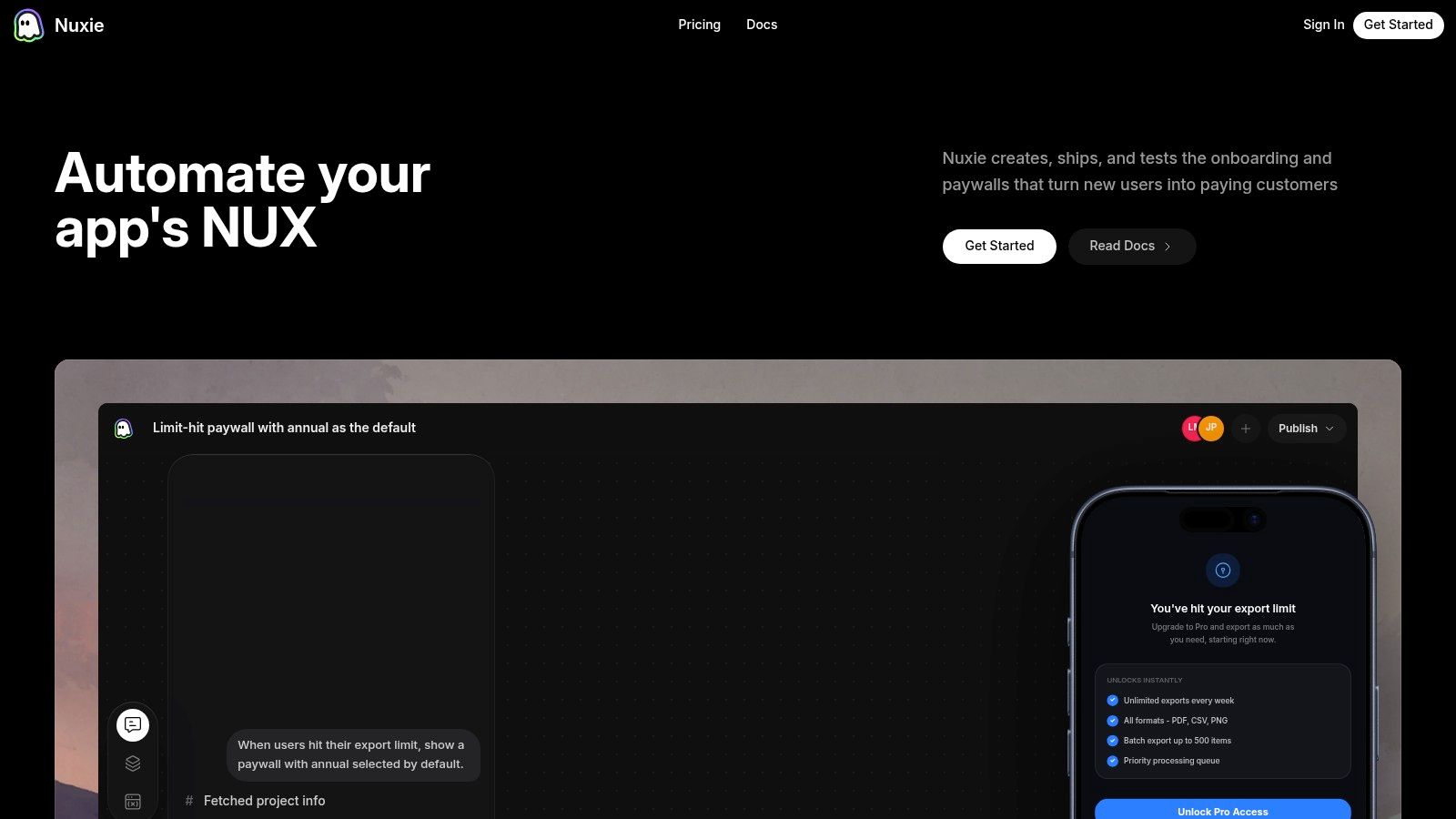
That's one reason teams use platforms that combine in-app journeys, experiments, analytics, and entitlement awareness. Nuxie is one example. It supports remotely shipped flows across iOS, Android, React Native, Flutter, Unity, and Unreal, with provider-agnostic analytics, billing, and entitlement data, so the quiz can react to purchase state without forcing a revenue-share billing model.
Cross-platform details that matter
The implementation details change by stack.
iOS and Android
Native apps usually give you the best performance for rich transitions and lower-level entitlement checks. Watch for:
- Lifecycle restoration after app backgrounding
- Deep-link re-entry into the correct post-quiz node
- Accessibility labels on card-style answer controls
- Local caching when a flow definition updates mid-session
React Native and Flutter
These stacks make UI parity easier, but state synchronization can drift if native purchase state and JS or Dart flow state aren't aligned. Avoid quiz completion logic that depends on late-arriving bridge events.
Unity and Unreal
Games add different constraints. You may need the quiz to coexist with asset loading, scene transitions, and controller navigation. Keep the flow lightweight, avoid blocking first-play responsiveness, and make sure any monetization branch respects current entitlement and store state.
Plan for offline, fallback, and resume
Remote delivery doesn't remove reliability requirements. It increases them.
Build these paths before launch:
- Cached last-known flow so first-run onboarding still works offline
- Safe default branch if remote targeting fails
- Resume behavior after app kill or forced update
- Versioned schema handling if old clients receive new content structures
Rich motion can help here too, especially with Rive-powered components, but only if animation state doesn't interfere with answer state or screen progression.
The implementation bar for an onboarding quiz app is higher than it looks. The teams that succeed usually narrow the flow, centralize the rules, and make the client responsible for rendering and event emission, not business decisions.
Measuring Quiz Performance with Analytics
If you can't tell whether the quiz improved activation or delayed it, your instrumentation is incomplete.
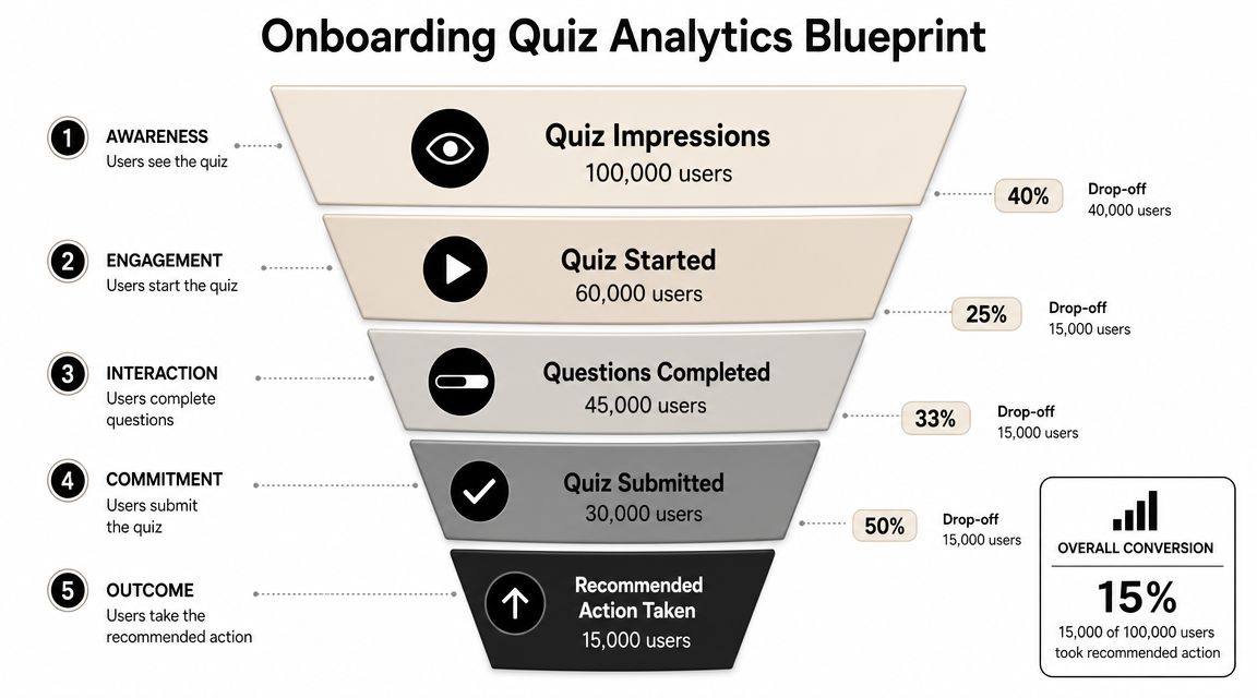
The cleanest approach is to model the onboarding quiz app as a funnel with event-level detail for every answer, branch, and downstream conversion moment.
A practical benchmark from Affective's guide to measuring app onboarding performance is to track completion rate, drop-off points, and time to complete. That same source notes that if only 30% of users complete onboarding, the flow needs work. It also cites that many successful onboarding flows take 1–3 minutes, users should see value within 30 seconds, and should reach a first meaningful action within 60 seconds.
Start the section of your dashboard with the funnel itself.
Event schema that answers real questions
These events are the core set I'd instrument:
quiz_started
Tells you whether users are accepting the invitation to begin.question_viewed
Reveals exposure by screen and helps detect rendering or sequencing issues.question_answered
Shows answer distribution and where users still engage.answer_changed
Useful when users hesitate or the options are unclear.branch_assigned
Confirms routing logic fired and lets you compare branch quality.screen_viewed
Captures non-question nodes such as recommendation, setup, or paywall screens.quiz_completed
Defines the top-level success event for the quiz itself.quiz_abandoned
Helps isolate exits from passive drop-off.paywall_viewed
Connects onboarding output to monetization exposure.trial_startedpurchase_completedentitlement_state_at_entry
These three separate conversion from eligibility and prevent false conclusions.
Metrics that matter more than completion
Completion rate is useful, but it's not enough. Some quizzes “win” on completion by becoming shallow and unhelpful. Others increase conversion while reducing completion because they intentionally skip low-intent branches.
Track at least these views:
| KPI | What it tells you |
|---|---|
| Completion rate | Whether the flow is finishable |
| Drop-off by screen | Which prompt or transition causes exits |
| Time per question | Which questions create hesitation |
| Return rate after interruption | Whether the flow survives real mobile behavior |
| Feature adoption after completion | Whether routing improved product usage |
| Conversion by branch | Whether personalization changed business outcomes |
One useful diagnostic is to compare users who completed the quiz against users who skipped or abandoned it, then split by branch and entitlement state. That's how you find whether a branch improved relevance or merely filtered more motivated users into better outcomes.
Later in the process, it helps to see another team walk through instrumentation and review habits in a live format.
Analytics should help you distinguish a better quiz from a longer path to the same result.
From Quiz to Conversion with A/B Testing
The quiz isn't the finish line. It's the first clean signal you get about user intent.
That signal becomes valuable when it drives experiments after the last question. Personalized onboarding campaigns have shown meaningful impact. Airship reported that apps running onboarding campaigns saw new users opt into push notifications 22% faster, with a 49% increase in day-30 activation, according to Airship's onboarding benchmark analysis.
Those numbers matter because quiz answers give you a structured basis for segmentation before the user has built much behavioral history.
What to test after the quiz
Many teams stop too early. They personalize a recommendation screen and call it done. The stronger move is to use quiz output as the assignment layer for downstream experiments.
Examples that are worth testing:
Goal-based paywall framing
Users who want speed may respond better to outcome-oriented copy. Users who want consistency may respond better to habit framing.Constraint-based offer sequencing
Someone who says they lack time may need a simpler setup path before any monetization prompt.Feature-path experiments
Route high-confidence users to a more direct product experience, while low-confidence users get more guidance.Reminder and re-engagement variants
Use stated preferences to tailor the first reminder setup or retention offer.
Use branch-level experiment design
A common testing mistake is to randomize everything globally. That muddies interpretation.
Instead, test within meaningful branches. If users selected different goals, compare variants inside those goal groups. That keeps the test closer to the actual product question: which next step works better for this kind of user?
A lightweight experiment map could look like this:
- User answers quiz.
- System assigns branch by goal and blocker.
- Eligible users enter a branch-specific experiment.
- Post-quiz screens, paywall copy, and offers adapt to that assignment.
- Conversion and retention metrics are analyzed by branch and variant.
If you need a practical framework for that workflow, this guide to A/B testing for mobile apps covers the operational side well.
Don't let personalization become overfitting
Not every answer deserves a custom path. Too many micro-branches create tiny cohorts and noisy results. Start with the variables most likely to change what the user needs next: primary goal, blocker, confidence level, entitlement state, and perhaps content preference.
Personalization works when it changes the next decision. It becomes clutter when it only changes wording.
This is also where platform sprawl hurts teams. If the quiz lives in one system, the paywall in another, experiments in a third, and purchase state in a fourth, you slow down every test and weaken attribution. The cleanest setups keep the journey connected from answer capture to conversion measurement.
Common Pitfalls and Your Rollout Checklist
Before shipping an onboarding quiz app, ask the uncomfortable question first. Should this quiz exist at all?
Nielsen Norman Group's guidance is direct. Onboarding should be added only after testing the app without onboarding and confirming that users struggle, as explained in Nielsen Norman Group's research on mobile app onboarding. Many apps are better served by dropping users directly into the interface.
That's the right filter. If the product is already obvious, a quiz may only delay value.
Pitfalls that sink otherwise good ideas
Some issues show up repeatedly in launch reviews:
Too many questions
Teams ask for profile depth when they only need routing inputs.No payoff after completion
Users provide answers, then receive a generic experience.Branch logic hidden in app code
Product can't inspect it, growth can't iterate on it, engineering inherits all the risk.Weak interruption handling
The app backgrounds, the store sheet appears, or a sign-in step breaks continuity.Instrumentation gaps
The team can't tell whether abandonment happened on a question, a transition, or the paywall.Localization and accessibility left for late QA
Card layouts break, progress labels are unclear, controller navigation fails, and text expansion ruins pacing.
Rollout checklist for production teams
Use this as a pre-flight list before rollout.
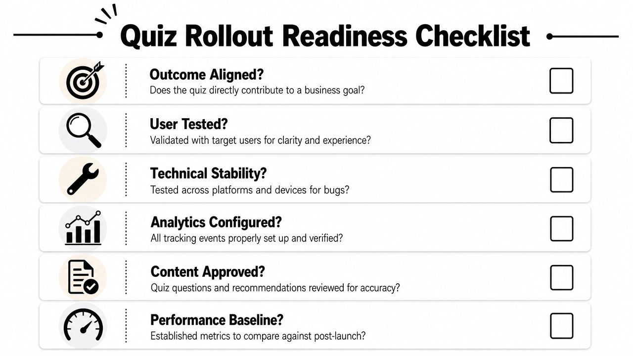
Product and design checks
Outcome is explicit
The team can state the intended post-quiz action and the business reason it matters.Questions are necessary
Every prompt changes a recommendation, branch, or message.Skip path is intentional
Users who don't want the quiz still reach value cleanly.Personalization is visible
The recommendation screen clearly reflects prior answers.
Engineering and data checks
State model is durable
Resume, retry, offline, and fallback behavior are defined.Event contracts are locked
Analytics names and properties are stable across platforms.Entitlement-aware routing is tested
Active subscribers, trial users, and non-entitled users don't enter the same monetization path by accident.Platform parity is verified
iOS, Android, React Native, Flutter, Unity, and Unreal implementations all respect the same branch logic where applicable.
Launch and optimization checks
A baseline exists
You know the current activation and conversion path before introducing the quiz.Experiments are scoped
The first test compares a small number of meaningful variants.Support and QA are briefed
Internal teams know the expected branches and can spot bad routing.Content owners can update safely
Copy and flow edits won't require risky app releases for every change.
The final sanity check is simple. If you removed half the questions tomorrow, would the app still know what to do next? If the answer is yes, remove them now.
If your team wants to build an onboarding quiz app that connects branching logic, analytics, experiments, paywalls, and entitlement-aware routing across iOS, Android, React Native, Flutter, Unity, and Unreal, Nuxie is built for that kind of connected in-app journey.